It’s Friday, a thunderstorm is raging outside and I am on vacation so there is not much else to do than some simple calculations. On a Swedish blog I made a comment regarding how everyone is ignoring the uranium elephant when it comes to energy discussions. Pessimism abound regarding the reserves of fossil fuels and doomsday is commonly predicted. But I have long held the view that nobody can seriously claim humanity will ever run out of energy (however that doesn’t exclude bumps on the road), many might find that to be a naive idea, but some very simple arithmetic proves my point.
The risk to the roughly 140,000 civilians who had been living within a few tens of kilometres of the plant seems even lower. Because detailed radiation measurements were un available at the time of the accident, the WHO estimated doses to the public, including radiation exposure from inhalation, ingestion and fallout. The agency concludes that most residents of Fukushima and neighbouring Japanese prefectures received a dose below 10 mSv. Residents of Namie town and Iitate village, two areas that were not evacuated until months after the accident, received 10–50 mSv. The government aims to keep public exposure from the accident below 20 mSv per year, but in the longer term it wants to decontaminate the region so that residents will receive no more than 1 mSv per year from the accident.
The WHO’s calculations are consistent with several health surveys conducted by Japanese scientists, which found civilian doses at or below the 1–15-mSv range, even among people living near the plant. One worrying exception is that infants in Namie town may have been exposed to enough iodine-131 to receive an estimated thyroid dose of 100–200 mSv, raising their risk of thyroid cancer. But data collected from 1,080 children in the region found that none had received a thyroid dose greater than 50 mSv. Chernobyl’s main cancer legacy in children was thyroid cancer.
But most importantly is this
A far greater health risk may come from the psychological stress created by the earthquake, tsunami and nuclear disaster. After Chernobyl, evacuees were more likely to experience post-traumatic stress disorder (PTSD) than the population as a whole, according to Evelyn Bromet, a psychiatric epidemiologist at the State University of New York, Stony Brook. The risk may be even greater at Fukushima. “I’ve never seen PTSD questionnaires like this,” she says of a survey being conducted by Fukushima Medical University. People are “utterly fearful and deeply angry. There’s nobody that they trust any more for information.”
To bad people like Sherman and Mangano, Gundersen, Busby, Caldicott, Matsumura and a host of other people and their fan clubs within the “environmental movement” are doing everything they can to spread excessive and scientifically unfounded fear of radiation.
The issue of recriticality in the damaged reactors at Fukushima pops up every now and then (a few examples link1, link2, link3, link4). Perhaps it is worth taking a look at what recriticality means, how likely it is and what it would mean if the cores goe critical. These posts will contain some maths and give some insight into basic reactor physics. Despite what most people think it is actually quite easy as long as one can follow the solution of some simple differential equations.
We will look at two different cases, in the first case the core has melted completely and is as a molten puddle or bed of “gravel” at the bottom of the vessel. In the second case the fuel rods are still mostly geometrically intact while the control rods have melted. If I have energy I might throw in a section about criticality in spent fuel pools as well at the end. We start with the completely molten core because it is easier and highlights all the relevant physics.
What exactly is criticality?
Fission is a reaction whereby a incoming neutron hits a nucleus, the nucleus then has a certain probability (depending on the energy of the neutron, what nucleus it is etc) of splitting into two roughly equally large pieces and in the process emit 2-3 new neutrons. Those neutrons can in turn hit new nuclei that causes more fissioning and voila, we have a chain reaction. If we assume we have a system where nothing is happening and we send in a burst of neutrons, those neutrons, that we will call the first generation, will cause an initial amount of fission reactions that produce a second generation of neutrons which goes on to create a third generation etc. Criticality is simply defined as the ratio between a subsequent generation with the one preceding it, it is usually designated by the letter K.
Bill Gates has fully realized the potential of nuclear and he has spoken often and a lot on the issue. Here are a few videos that are well worth watching.
A former DOE assistant secretary for renewable energy, Robert Alvarez, has lately been spreading a lot of fearmongering about the stability of the spent fuel pool in reactor 4 at Fukushima. From the start of the accident a lot of question marks regarding the pool has been floating around, including the statement from the NRC chairman Jaczko that the pool might have run dry. Later is was however shown that the pool was never in any danger, it was never damaged in the earthquake and tsunami and it never ran dry. TEPCO released footage from the pool itself and its clear that it is intact and full of water.
A powerpoint presentation made by professor Majia Holmer Nadesan is getting some attention around the web, in the presentation she claims that the Japanese authorities, among others, lied and covered up information about the Fukushima accident. So let’s have a look at it.
Helen Caldicott declined to answer questions at a lecture...
The recently started Nuclear Literacy Project has a welcome entry, a person with knowledge in the field of radioactivity and nuclear engineering reports on a visit to an anti-nuclear seminar with Helen Caldicott. The person, PhD student Kallie Metzger, entered the meeting with some hope of a good discussion where there would be room for incorrect statements to be straightened out.
What Kallie found, however, was that the renowned anti-nuclear activist was more keen on scaring people into thinking like herself, and questions from the audience were responded to in a hostile and arrogant manner, if at all.
...attended by Kallie Metzger, Ph.D student in nuclear engineering.
After watching a few videos with Helen Caldicott, including her infamous TV-debate with George Monbiot from last year, we are, unfortunately, not surprised about her behaviour. The good news is that Kallie went to listen to Caldicott, and reported about it. We need more people like Kallie who attends these kind of meetings and try to raise relevant questions when remarkable claims are being stated. If Caldicott continues her tour in the same arrogant manner her audience should diminish rather quickly down to the die-hard fans of her outrageous claims.
So the hero of the week is Kallie Metzger. Read her account of the Caldicott seminar here. Then ask yourself: will you be our next hero?
It has been a busy day here at the NPYP center, where the members of Nuclear Power Yes Please held a press conference. They recently discovered a devastating text by Professor Chris Busby, where he shows that their criticism of his research is completely unfounded. The NPYP Scientific Director Mattias Lantz had attacked Professor Busby’s articles about Fallujah (here, here, and here), by making a comparison of the sex-ratio (i.e. the number of boys born vs number of girls born) between the Iraqi city of Fallujah and his own city of birth, Avesta in Sweden. According to Lantz the variations in Avesta were as large, or larger, than the ones in Fallujah, so he reasoned that one could not claim that the variations in Fallujah were due to depleted uranium (DU). Professor Busby turned the data from Avesta around, and showed that Lantz had used the data in a dishonest way, even trying to hide an obvious correlation between increased sex-ratio in Avesta and the 2003 war in Iraq. Professor Busby’s eminent rebuttal can be found on the LLRC web site (here). Below is the figure made by Lantz, with Professor Busby’s hand-written notes that give evidence of the dishonesty of Lantz.
The plot with sex-ratio for Avesta where Professor Chris Busby could reveal the scientific dishonesty of Lantz and his NPYP cronies.
– ”I never even thought of the correlation,” a humiliated Mattias Lantz said at the press conference, ”but Professor Busby clearly shows that the deviating sex-ratio in Avesta around 2004 is due to the DU-weapons used in Iraq. Furthermore,” Lantz continued, ”this means that all of our past criticism of Professor Busby falls apart, just like a house built from a deck of cards. I now realize what an omnipotent genius he is. He is right about everything, even when he cheats with statistics.”
– ”And he is a great musician!” Gender Issues Director Nils Rudqvist adds.
– What does this mean for the future of NPYP?
– ”This changes everything.” says Policy Director and NPYP founder Michael Karnerfors, ”We have been wrong about all these issues; about radiation effects, nuclear power, cell phone radiation, chem-trails, dowsing, crystal healing and the HAARP experiment. Therefore, we will now turn sides in the debate on all these issues, and we will join Professor Busby, Mona Nilsson, Lennart Hardell and all the other serious researchers in their noble quests. From now on, scrutinizing alarmist claims, checking statistics, or asking the simple question ‘Is this relevant?’ has no place in what we consider to be a serious debate. Google was created to find the scary claims, not to scrutinize them. Many people are scared about radiation. From now on we will help them to maintain that status.”
– What about your close ties to the nuclear industry?
– ”We will pay back every penny of the funding we got from those bastards,” says Financial Director Christoffer Willenfort, ”and those of us who are employed by the nuclear industry will submit letters of resignation today, we are all done with it.”
– And the organization?
– ”The first reaction was of course that we should dismantle NPYP and join other groups, but after some intense brain storming we decided that it is better to continue, although under a different name.”
– ”Yes, from today we are Nuclear Power No Please,” confirms the Public Relations Director Johan Kreuger, ”and here is the new logotype!”
An embarrassing silence grew in the press room, until somebody in the audience dared pointing out an obvious error in the spelling.
The first version of the new Nuclear Power No Please logotype.
– ”C’mon people, give us a break!” Kreuger burst out. ”We have been wrong about so many things for years, so how can you expect us to get every tiny detail right immediately?”
– What is Lantz’ status within the organization, can he continue to be a member?
– ”Well,” says Karnerfors, ”at first we thought that he had to go. We were all very disappointed with him and felt that we needed to distance ourselves from him and the dishonesty that he brought upon us. But we are all to blame. It was certainly Lantz who would initiate the studies of Professor Busby’s claims, but we all started to act like stupid physicists and make independent double checks of numbers and other details. That was of course foolish of us, we should have trusted Professor Busby from the beginning without asking any questions.”
– So you now believe in Professor Busby’s claims?
– ”How can you not, after what we have been through?” Reactor Technology Director Johan Simu says. ”Professor Busby has an expertise in so many scientific fields, not only in radiation effects. A few months ago he introduced a new definition of the term ‘spontaneous fission’, and with it he showed that TEPCO is lying about the status of the reactors in Fukushima. With the new definition, the reactors must clearly be active in a critical configuration. My personal reflection at the time was that this is utter nonsense. But now, after Professor Busby’s proof of our dishonesty, I am all for it. The effects will be tremendous; all courses in reactor physics will have to be revised, and the commercial codes used today for criticality calculations have to be changed. But that is not all, recently he also showed that Einstein is wrong.”
– What?
– ”Yes indeed, Professor Busby’s interpretation of the twin paradox is quite convincing. He has also promised to explain quantum mechanics on Youtube, something that we are all looking forward to. It is about time that somebody settles the issue whether that cat of Schrödinger is alive or not, the world deserves to know. Furthermore, this poor creature has been in this un-collapsed wave function state for so long, it is clearly a violation of animals rights that needs to be brought to an international court. Professor Busby’s expertise also in legal matters will be very helpful in order to bring the perpetrators to justice.”
On the way out from the press room we manage to get hold of Mattias Lantz for a personal comment, he looks tired and stressed out.
Our reporter Kazue Avril gets a moment with a humiliated Mattias Lantz at the NPYP press conference.
– Will you apologize to Professor Busby and the other people that you have attacked over the years?
– ”No, of course not!” Lantz responds rather agressively. ”Earlier we would have done such a thing, or corrected our statements if they were found to be in error. Now when we have changed sides in the debate we will follow the established customs of our new friends. Apologies or amends are out of the question. Instead we move on forward, though in the opposite direction as before.”
– How did you react when it became clear that you had been so wrong about Professor Busby?
– ”I felt awful, of course. Not so much for my unfounded attacks on Professor Busby, but on a personal level it is devastating. In the plot that Professor Busby turned against me there is also a peak with high sex-ratio in Avesta during the 1970’s when I was born. This puts the question about my gender at stake, maybe I was supposed to be a girl? This will take years of psycho-therapy to sort out.”
Then he excuses himself and pushes through the crowd towards the entrance, stopping every now and then, asking people if they know where he can get hold of a good beret.
We get a private interview with Industry Liaison Director Johan Kihlberg.
– ”Former Industry Liaison Director, if I may! The title does not exist any more now that we have severed the ties with the nuclear industry.”
– So, what is your title?
– ”Alarmist Organizations Liaison Director.”
– Ok, ok, so how was the error of Lantz discovered?
– ”We knew for a while that something was not right. Lantz has of course always been obsessed with Professor Busby. Certainly the money from industry and Socialstyrelsen kept him motivated, but there was also something else, some sort of…envy. And during the last few months he has become more and more deranged. You could find him at late hours in his office, but he would not deliver any new blog posts or forum entries. If you met him in the corridor you could hear him mumbling weird things for himself.”
– Weird things?
– ”Yes, phrases like ’eminent scientists’, ‘Bramhall is not a pushover’, ‘ICRP doesn’t get it’, or ‘there must be a third event’ were often repeated. Things like that. Then, a few days ago in the coffee room he made no sense at all, trying to convince us that ‘the alarmists get laid more often than we do’ and that we should buy a boat, or two. Last Friday we discovered that he had asked the market analysis division for an evaluation about entering the field of anti-radiation pills, and there were follow up plans for major investments in this field. When this was found out we decided to check his computer. It turned out that for the last month he had used the computer for only one thing, to visit the ‘Dishonesty’ page on the LLRC web site, over and over again.”
– So what did you do?
– ”It was the first time that any of us saw that web page, and after reading it we realized that it was all over. A crisis meeting was held, thereafter we summoned Lantz in order to have him explain himself. There was an intense discussion, with harsh words being exchanged in all directions, but finally we could agree on a strategy and decided to call for the press conference.”
– These plans that Lantz had initiated for anti-radiation pills, how far had he gone with them?
– ”Actually, very far,” Kihlberg responds with some excitement.
– So how did you stop it?
– ”We didn’t. The analysis shows that we can make a huge profit even if we sell the pills at half the price compared to what Busby and his friends had in mind. We have some connections in Japan that will help us with the promotion, there are many ways to scare people into becoming your customers. For instance the Japanese TV-channel NHK has been very helpful by making an alarmist documentary in which the credibility of ICRP is undermined. We are also considering to buy the recently closed candy factory in Gävle. In that way we can have a local production directly in the areas that were most affected by the Tondel study.”
– You mean the areas that were most affected by the Chernobyl fallout?
– “No, by the Tondel study.”
– Ah, whatever. So you will manufacture and sell pills in order to raise money for the suffering children?
– ”What do you mean? We have to make up for the losses now that we have stopped the funding from the nuclear industry. We are the good guys now, we need to make a living. Just look at Green Audit, the Cancer and Birth Defects Organization, and so on. They are registered as companies, not as charities, why should we be any different? Why live on secret funding from evil companies when we can make as much money in the open by exploiting the gullible, the naive, and the vulnerable? To have funding from the industry in order to change people’s opinion is a difficult task, it is much easier to get money directly from concerned citizens in order to help them preserve their already established views. Busby is of course a huge inspiration in these matters, but we are also looking at other options.”
– What kind of options?
– ”For instance, Joseph Mangano and his Radiation and Public Health Project is a good example. They have managed to recruit celebrities like Alec Baldwin and Christie Brinkley for the fundraising. And they are very successful, just look at the suits of Mangano! So we hope to be able to do something similar from a Swedish perspective, if we can get stars like Manne the Clown and Solveig Ternström on our team, then we are all set.”
– So the future is bright…?
– ”Yes, brighter than ever. This has been a severe crisis situation for us, but thanks to Professor Busby we are finally on the right track. An event like this does not happen every day, but today it did indeed happen.”
An old news article is circulating around that states that 68 tons of fuel has melted in reactor number 1 and that it was close to breaching the bottom of the containment. The article is several months old but for some reason I have seen it pop up again on facebook so I though it is worth examining the article briefly. In particular I want to examine this statement.
Only 37 centimeters of concrete remains between the fuel and the vessel’s outermost steel wall in the most damaged area, TEPCO said.
This wording is repeatedly used by anti nuclear sources to imply that a much worse disaster was very close to happening. What the articles fail to mention however is that there is A LOT more concrete between the ground and the molten core. The reactor building itself is a very thick concrete structure. Will Davis, on his excellent blog Atomic Power Review, talked about this the first time the news about the number one vessel failure showed up last November. Some of what he wrote is worth repeating and I hope he doesn’t mind me repeating it here and also posting a picture from his blog.
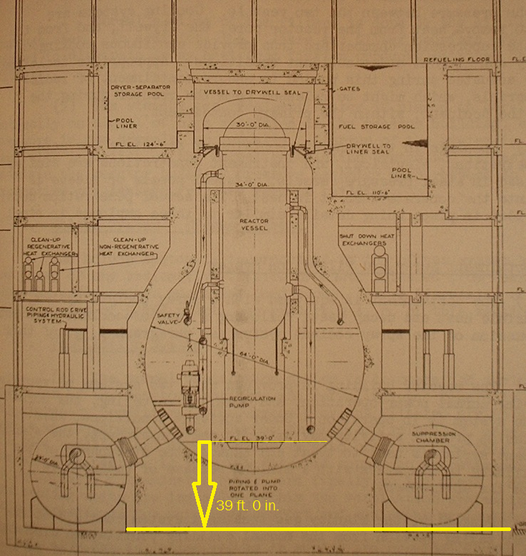
The NHK report indicates a melt depth of about 2.1 feet(64 cm, my note /Johan). The distance to the ground is roughly eighteen times this depth from the dry well interior floor to grade. Below is a drawing from WASH-1082 which I’ve marked to show the distance from the dry well floor to the grade outside, which on the particular plant shown is 39′ 0″(11.8 meters, my note /Johan). I do not presently know the exact measurement at Fukushima Daiichi No. 1 but it is likely within ten percent of this measurement… meaning that in the worst case that TEPCO is describing, by its own data, the core material may have melted only about as much as 5% of the distance to the grade.
I encourage everyone to read the rest of his blog as it is by far the best information source for the Fukushima accident.
I also want to add this picture of the mark I containment that schematically shows the thick concrete even more clearly! Picture found at the blog “The capacity factor”.
So we see that there is a tremendous amount of concrete below the shell of the containment structure. The hints and suggestions that the core would only have to melt another 37 centimeters for a unnamed disaster to take place is obviously false. In reality the shell of the containment is integrated into a thick concrete structure and the molten core would have to melt through several more meters, likely around 10 meters, to get out of the reactor building itself.
The cleanup of the containment is going to be a very hard and messy job, much worse than the cleanup of TMI was. But the core is still a long long way from the ground.


The spent fuel pool at Fukushima #4
Published by Johan on May 11, 2012A former DOE assistant secretary for renewable energy, Robert Alvarez, has lately been spreading a lot of fearmongering about the stability of the spent fuel pool in reactor 4 at Fukushima. From the start of the accident a lot of question marks regarding the pool has been floating around, including the statement from the NRC chairman Jaczko that the pool might have run dry. Later is was however shown that the pool was never in any danger, it was never damaged in the earthquake and tsunami and it never ran dry. TEPCO released footage from the pool itself and its clear that it is intact and full of water.