
Last updated on March 1, 2013
Muck-raking is a journalistic activity with a proud history that since the days of Ida M. Tarbell and Jacob Riis have led to exposing cases of fraud, social injustice, conspiracies, environmental pollution, and other inconvenient truths, to the public. On a number of occasions it has led to changed laws and policies, and the end to political careers when somebody’s darker sides have been exposed. One important aspect of this activity is to check the facts carefully in order to get them right. Otherwise the muck-raking turns into cheap sensationalism in order to sell a few extra numbers. Every country has its own collection of this less honourable tradition that stems from the yellow press days of William Randolp Hearst and Joseph Pulitzer. However, the people behind the bi-weekly newsletter ConterPunch proudly refer to themselves in the following way:
Ours is muckraking with a radical attitude and nothing makes us happier than when CounterPunch readers write in to say how useful they’ve found our newsletter in their battles against the war machine, big business and the rapers of nature.
In a follow-up editorial on the Sherman-Mangano study (link to the original article here), CounterPunch editor Alexander Cockburn explains that they have received plenty of critique after publishing the article, several readers suspected cherry-picking. So they had their “statistical consultant”, Pierre Sprey, go through the data. And indeed, he found that there was no ground for the claims by Janette Sherman and Joe Mangano, when one includes a longer time span for the period before Fukushima. By increasing the time from the four weeks, that happen to be in the dip, to ten weeks, the relative increase in infant mortality after Fukushima disappears. So far so good, their control of the data verifies the conclusion that I and others independently of each other made (my version here). Now the interesting part comes. Cockburn says it the best himself:
But then Sprey went further and looked at the Sherman/Mangano selection of eight cities from the 122 reporting to CDC: the eight were Berkeley, Portland, Sacramento, San Francisco, San Jose, Santa Cruz, Seattle and Boisie. Apparently, they selected Pacific Coast cities that were more or less within 500 miles of the coast and north of Santa Cruz. However their selection did not include all CDC cities within this categorization, because they left out Tacoma and Spokane, thus leaving themselves open to suspicions of cherry-picking cities. So Sprey included Tacoma and Spokane in the data set he reviewed in order to be geographically complete. When Sherman and Mangano’s overall selection of cities failed to produce a significant result for ten weeks before and ten weeks after March 11, 2011 (as well for the ten equivalent weeks in 2010 as compared with the same weeks in 2011) Sprey elected to look at smaller, geographically consistent groupings of cities. The results were striking. Simply by moving the boundary line northward from Santa Cruz Sprey found that the four northernmost Pacific Northwest cities in the CDC sample – Portland, Tacoma, Seattle and Spokane – show remarkably significant results – a larger infant mortality increase than the original Sherman-Mangano results. During the ten weeks before March 11 those four cities suffered 55 deaths among infants less than one year old. In the ten weeks after Fukushima 78 infants died – a 42 per cent increase and one that is statistically significant. To confirm once again that these results were not due to seasonality Sprey compared these infant deaths in the ten weeks after Fukushima to the deaths in the equivalent ten weeks a year earlier. The results were almost identical with the ten weeks before Fukushima in 2011. Within the equivalent ten weeks of 2010 53 infants died in these four cities.
Imagine my surprise. I had been playing with the data a bit, and also checked what happens if you include Spokane and Tacoma (see the forum post for details). My conclusion was that Spokane and Tacoma did not matter, while Sprey’s re-analysis shows a 42% increase! I must have done some error, or? There were several steps when I copied the information into a spreadsheet, quite tedious to get it into the format that I wanted, so there were many possibilities for mistakes. So I made a few random double checks and could not find any error, but it would be very time consuming to go through the data for every week again. I also checked the published erratas on the CDC pages in order to see if I had missed some vital correction. But then I found a quicker way on the CDC web pages, it turns out that one also can download the data for individual cities or regions directly for the entire year (here). So I extracted the data for the four cities from this link, in this way I would do an independent check of my earlier results. Anyone can check it themselves on the link above. Here is my table:

The table includes weeks 1-23 for 2011. If I understand what Cockburn writes correctly, Sprey have used weeks 2-11 for the time period before Fukushima (compared with the four weeks used by Sherman and Mangano) and weeks 12-21 for the time period after Fukushima (i.e. the same as Sherman and Mangano). So, with the use of a very complicated mathematical operation, called addition, I get 59 for the period before Fukushima, and 53 for the period after. This is identical with my earlier count. As a final check I asked another member of NPYP to make an independent extraction of the data from the CDC data base and then perform the mathematical operation mentioned above. Once again identical results. Sprey got 55 and 78, close enough on the first one, but the second…
Unless I am missing something vital, the numbers in the table above speak for themselves; There is no dramatic increase for these four cities, so something must have gone seriously wrong in Sprey’s re-analysis. Actually there are more strange things, Cockburn writes that for the 8 cities the new analysis gave “an increase of infant deaths of only 2.4 per cent” after Fukushima, while my analysis gave a 14% decrease (it is not statistically significant, but if I was pro-nuclear in the same way that Sherman and Mangano are anti-nuclear, I would of course argue for that Fukushima has caused a reduction in the infant deaths in northwestern U.S., and that I had the numbers to show it). Could it be the addition part that failed, or does wishful thinking of the style “there must be an increase in infant mortality somewhere due to Fukushima” play a part? Whatever the cause, Cockburn is explaining the significance of some details in the data from Sprey:
Looking a little more closely at the time trend of the infant deaths after Fukushima, Sprey found that the most dramatic increases in deaths were in the two weeks right after the March 11 disaster. Those two weeks saw a near tripling of weekly deaths, followed by a period of somewhat elevated weekly deaths lasting for about five weeks – roughly 25 per over the pre-March 11 rate, then settling down close to the average pre-Fukushima death rate for the last three weeks of the ten week period post-disaster. These results are necessarily approximate because the weekly sample of deaths is too small for precise statistical conclusions.
This part if of course nonsense when we look at the numbers. Let’s plot it as well:

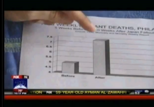
Well, as Cockburn says, there is a “dramatic” increase immediately after Fukushima, by a factor of 3. Now that we have the numbers ourselves we can conclude that a factor of 3 means a jump from 3 on week 11 to 9 on week 12. We have a similar increase in numbers between weeks 5 and 6, but Cockburn does not indicate that as being dramatic, in fact he does not mention it at all. To his defense, the numbers he is looking at are not the same as mine, but where do they come from? Whatever the cause of the error, the dramatic 42% increase now looks more like a…decrease, the mean values are shown as horizontal lines (blue before Fukushima, orange after) in the plot above. Let’s plot the data again to make sure, we can do it in the same way as Mangano does, to make it clear for everyone:

This is, of course, a very dishonest way of plotting things if you want to show the whole picture, but if Joseph Mangano can do it, they why shouldn’t we? The main point is anyhow clear, there is no increase in infant mortality in the United States of America due to Fukushima. Got it? And if there is, we will no find out through sloppy analysis by charlatans like Sherman and Mangano. And, as it seems, not through the statistics consultants that muck-raking journal CounterPunch is using. It will take careful analysis by serious researchers to find out if there is any real effect. If they would bother to start looking. But Mangano said in the Fox News interview
:
this is a red flag to raise for more studies to be done
Actually, he is right. It is a red flag to raise for careful scrutiny of all the earlier work by Sherman, Mangano, and their alarmistic friends. Some of their earlier studies have become “common knowledge” in anti-nuclear groups. Last year we had a member of the green party in Sweden standing in the parliament during a debate about nuclear power, where he referred to studies of increased childhood leukemia, authored by Sherman and Mangano, and of course the Chernobyl book edited by Sherman. Maybe we all can move on with life and more pressing issues now, ok? Those who want to hang on to all bad things with Fukushima still have plenty of material to work on. But stick to the facts, please. Ok? Two questions remain:
- Why is Alexander Cockburn’s editorial so forgiving towards Sherman and Mangano? If I had been the editor of a journal, I would be furious if it turns out that some authors make fools of themselves, and of me as an editor, by cheating with data, and I would make sure that they were never to publish anything more in my journal. Ever. Especially when it comes to such an important issue that worries millions of people, not the least parents of small children. But Cockburn is so happy to have, through Sprey’s re-analysis, found that there was indeed an increase, so Sherman and Mangano was right even if they cheated, no shadow should fall upon them. After all, CounterPunch is a muck-raking newsletter with a radical attitude, so there must be some muck to find, and indeed they found it. But when it now turns out that not even this was right, what will he write in the next editorial? “We follow proudly in the sensationalist footsteps of William Randolph Hearst!” or what? We have already established that Janette Sherman and Joseph Mangano should be very ashamed of themselves. If I was Alexander Cockburn I would at least be quite embarrassed.
- What went wrong in Sprey’s re-analysis?
An email has been sent to Alexander Cockburn, requesting that they do a muck-raking investigation of the skills of their statistical consultant. Furthermore, CounterPunch now has a great opportunity to recover their lost credibility; How about a couple of articles with in depth investigations of the earlier works of Janette Sherman and Joseph Mangano? This could be the starting point in a long series of muck-raking articles where all the controversial statements from the anti-nuclear icons are carefully scrutinized, could it be that there are more “common truths” out there that are based on the same weak evidence (i.e. none) as in the present case? Alexander Cockburn, are you up to the task?
Mattias Lantz – member of the independent network Nuclear Power Yes Please
P.S. What about Seattle? Some observant persons may have noticed from the table above that Seattle does have an increase in infant mortality by a factor 3 between week 11 (2 deaths) and week 12 (6 cases). At least Seattle has an effect due to Fukushima, pretty please? Well, I’ll give you the plot for Seattle:

6 cases the week that the radioactivity reached Seattle, compared to 2 the week before, that must be significant! If you still insist on this kind of reasoning, it means that you somehow have ignored the plots I show here and here. Still not convinced? Then go to the CDC data base and pick out the numbers for yourself, and please do not forget to check the pattern for Seattle week by week for earlier years. Here are the links to the CDC data base, instructions for some of them are found if you place the pointer over the link. I recommend to start with the last one, it is the easiest to handle:
http://www.cdc.gov/mmwr/mmwr_wk/wk_cvol.html
http://www.cdc.gov/mmwr/preview/mmwrhtml/mm6010md.htm?s_cid=mm6010md_w#tab3
http://wonder.cdc.gov/mmwr/mmwrmort.asp
Warning: Declaration of Social_Walker_Comment::start_lvl(&$output, $depth, $args) should be compatible with Walker_Comment::start_lvl(&$output, $depth = 0, $args = Array) in /var/www/nuclearpoweryesplease.org/public_html/blog/wp-content/plugins/social/lib/social/walker/comment.php on line 18
Warning: Declaration of Social_Walker_Comment::end_lvl(&$output, $depth, $args) should be compatible with Walker_Comment::end_lvl(&$output, $depth = 0, $args = Array) in /var/www/nuclearpoweryesplease.org/public_html/blog/wp-content/plugins/social/lib/social/walker/comment.php on line 42
Mattias, I’m glad to read your comment. It seems that we have indipentently
found a serious error (both arithmetical and logical) in the
CounterPunch reply. Isn’t it?
http://www.antoniorinaldi.it/e-nucleare-disinformazione
Salve Antonio,
I am also happy to see that more people are looking into this by themselves, it is the only way to counter the nonsense. And, to tell you the truth, it is a relief that your conclusions are the same. Although several double checks there could have been some mistake by me. Now it is up to Cockburn and Sprey to explain themselves.
Keep up the good work, Lantzelot / Mattias Lantz!
When reading this, somehow, I come to think about wiping up other peoples vomit. Or wiping up after people that are too drunk to actually shit _in_ the toilet.
Test 1
Test 2
Test 3 test 3.5
Test 4
Test 5
Tjena Mattias,
Hörde att du gillar att suga slak! Du är en hjälte!
@ Jens: Spam-markerad… du fattar varför.
[…] Counterpunch, where it was quickly criticized. The critics charged that the authors had cherry-picked federal data on infant deaths so they would spike around the time of the Fukushima disaster. Passions over nuclear safety further […]
[…] Well, they fudged the numbers is what they did, as explained here (and here, here, here, here, to name but a few of the sites that have taken the time to look at the actual […]
[…] States. The research, which was harshly criticized by Scientific American’s Michael Moyer and others, was published in the peer-reviewed Journal of International Health Services, and I had asked the […]
[…] research, which was harshly criticized by Scientific American’s Michael Moyer and others, was published in the peer-reviewed Journal of International Health Services, and I had asked the […]