Barry Brooks over at Brave New Climate has created a new video that summarises the need for nuclear in 2,5 minutes. Well worth watching and spreading!
20 CommentsMonth: June 2011
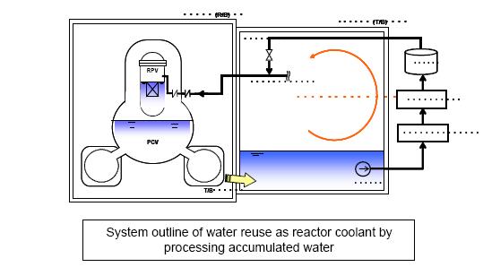
We are now over 3 months into the Fukushima accident, progress is creeping along at a steady pace. Since our last update there has been lots and lots of new and I won’t try to cover it all. The biggest news I want to share now is that TEPCO has gotten some kind of recirculation cooling working, it was reported today by Will Davis at Atomic Power Review(by far the best blog to keep an eye on for Fukushima news, I highly recommend to read it).
In short water is leaking out of the containment buildings into the turbine buildings, the water is pumped from the turbine buildings into the water treatment facility, then from there its pumped back into the reactor. Its like I described in the last update on may 18th (shown on the picture below) and one of the steps in the plan TEPCO released that month.
If everything goes well now the volumes of contaminated water will start to creep down, a proper toast is in order!
Another fairly recent news is that NRC announced that the spent fuel pools in Fukushima never went dry. That really calls into question Chairman Jaszco’s recommendation for a larger evacuation zone for american citizens in Japan than what the Japanese authorities had decided.
There has also been a lot of bullshit flying around about the situation in Fort Calhoun due to the river flooding around the nuclear power plant. Claims about goverment cover ups, Russian authorities warning about disaster etc. I haven’t bothered to look more in detail into it yet, but so far the reactor has both working diesels and connection to the external grid and quite a bit of margin before the river even comes near to flood over the flood protections. Here is a good post by Neutron Economy about the situation.
Why I’m not worrying about Fort Calhoun (and you shouldn’t either)
Links(English)
Rod Adams Ted Rockwell – Fukushima: It’s Not About Radiation, It’s About Tsunamis
NEI Nuclear Notes Friday Update
World Nuclear News Fukushima cover on its way
The Neutron Economy Expected Doses Over a Year and Evacuation of Fukushima Towns
Will Davis How the Misinformation Superhighway affects Nuclear Energy
Will Davis JAIF Public Opinion Poll Data
Links(Swedish)
Med örat mot rälsen Kärnkraften igen
Kultur Ska vi glömma Fukushima?
Seppo Laine Mycket värre än man kunde tro
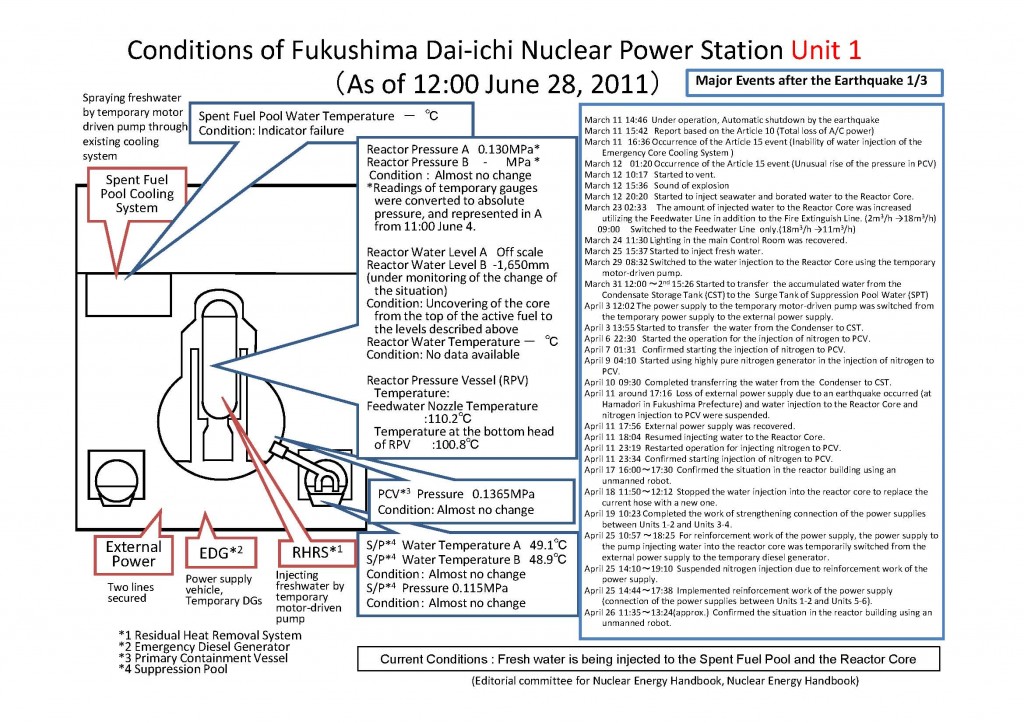
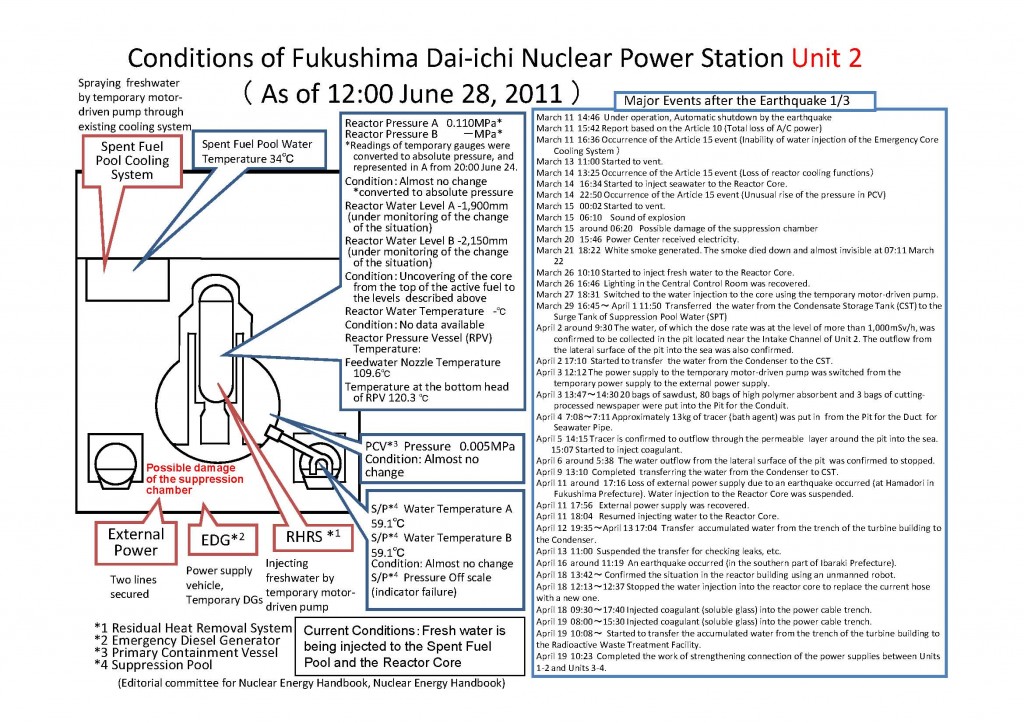
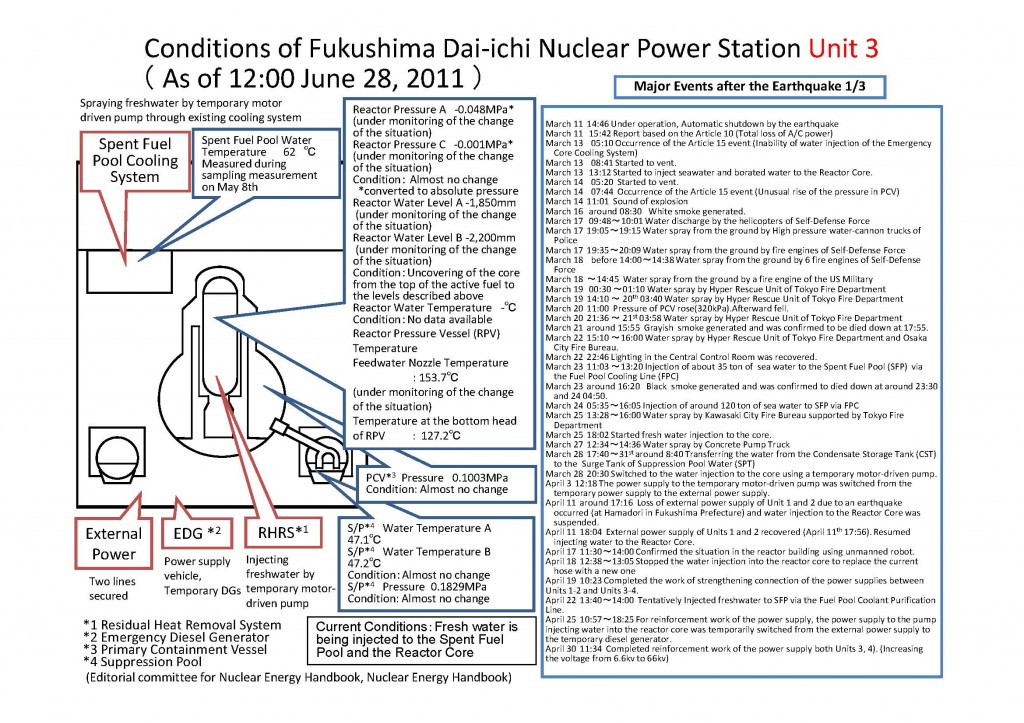
Status for each reactor
/Johan
4 CommentsMuck-raking is a journalistic activity with a proud history that since the days of Ida M. Tarbell and Jacob Riis have led to exposing cases of fraud, social injustice, conspiracies, environmental pollution, and other inconvenient truths, to the public. On a number of occasions it has led to changed laws and policies, and the end to political careers when somebody’s darker sides have been exposed. One important aspect of this activity is to check the facts carefully in order to get them right. Otherwise the muck-raking turns into cheap sensationalism in order to sell a few extra numbers. Every country has its own collection of this less honourable tradition that stems from the yellow press days of William Randolp Hearst and Joseph Pulitzer. However, the people behind the bi-weekly newsletter ConterPunch proudly refer to themselves in the following way:
Ours is muckraking with a radical attitude and nothing makes us happier than when CounterPunch readers write in to say how useful they’ve found our newsletter in their battles against the war machine, big business and the rapers of nature.
In a follow-up editorial on the Sherman-Mangano study (link to the original article here), CounterPunch editor Alexander Cockburn explains that they have received plenty of critique after publishing the article, several readers suspected cherry-picking. So they had their “statistical consultant”, Pierre Sprey, go through the data. And indeed, he found that there was no ground for the claims by Janette Sherman and Joe Mangano, when one includes a longer time span for the period before Fukushima. By increasing the time from the four weeks, that happen to be in the dip, to ten weeks, the relative increase in infant mortality after Fukushima disappears. So far so good, their control of the data verifies the conclusion that I and others independently of each other made (my version here). Now the interesting part comes. Cockburn says it the best himself:
But then Sprey went further and looked at the Sherman/Mangano selection of eight cities from the 122 reporting to CDC: the eight were Berkeley, Portland, Sacramento, San Francisco, San Jose, Santa Cruz, Seattle and Boisie. Apparently, they selected Pacific Coast cities that were more or less within 500 miles of the coast and north of Santa Cruz. However their selection did not include all CDC cities within this categorization, because they left out Tacoma and Spokane, thus leaving themselves open to suspicions of cherry-picking cities. So Sprey included Tacoma and Spokane in the data set he reviewed in order to be geographically complete. When Sherman and Mangano’s overall selection of cities failed to produce a significant result for ten weeks before and ten weeks after March 11, 2011 (as well for the ten equivalent weeks in 2010 as compared with the same weeks in 2011) Sprey elected to look at smaller, geographically consistent groupings of cities. The results were striking. Simply by moving the boundary line northward from Santa Cruz Sprey found that the four northernmost Pacific Northwest cities in the CDC sample – Portland, Tacoma, Seattle and Spokane – show remarkably significant results – a larger infant mortality increase than the original Sherman-Mangano results. During the ten weeks before March 11 those four cities suffered 55 deaths among infants less than one year old. In the ten weeks after Fukushima 78 infants died – a 42 per cent increase and one that is statistically significant. To confirm once again that these results were not due to seasonality Sprey compared these infant deaths in the ten weeks after Fukushima to the deaths in the equivalent ten weeks a year earlier. The results were almost identical with the ten weeks before Fukushima in 2011. Within the equivalent ten weeks of 2010 53 infants died in these four cities.
Imagine my surprise. I had been playing with the data a bit, and also checked what happens if you include Spokane and Tacoma (see the forum post for details). My conclusion was that Spokane and Tacoma did not matter, while Sprey’s re-analysis shows a 42% increase! I must have done some error, or? There were several steps when I copied the information into a spreadsheet, quite tedious to get it into the format that I wanted, so there were many possibilities for mistakes. So I made a few random double checks and could not find any error, but it would be very time consuming to go through the data for every week again. I also checked the published erratas on the CDC pages in order to see if I had missed some vital correction. But then I found a quicker way on the CDC web pages, it turns out that one also can download the data for individual cities or regions directly for the entire year (here). So I extracted the data for the four cities from this link, in this way I would do an independent check of my earlier results. Anyone can check it themselves on the link above. Here is my table:
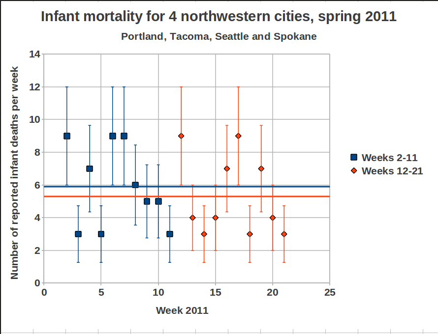
The table includes weeks 1-23 for 2011. If I understand what Cockburn writes correctly, Sprey have used weeks 2-11 for the time period before Fukushima (compared with the four weeks used by Sherman and Mangano) and weeks 12-21 for the time period after Fukushima (i.e. the same as Sherman and Mangano). So, with the use of a very complicated mathematical operation, called addition, I get 59 for the period before Fukushima, and 53 for the period after. This is identical with my earlier count. As a final check I asked another member of NPYP to make an independent extraction of the data from the CDC data base and then perform the mathematical operation mentioned above. Once again identical results. Sprey got 55 and 78, close enough on the first one, but the second…
Unless I am missing something vital, the numbers in the table above speak for themselves; There is no dramatic increase for these four cities, so something must have gone seriously wrong in Sprey’s re-analysis. Actually there are more strange things, Cockburn writes that for the 8 cities the new analysis gave “an increase of infant deaths of only 2.4 per cent” after Fukushima, while my analysis gave a 14% decrease (it is not statistically significant, but if I was pro-nuclear in the same way that Sherman and Mangano are anti-nuclear, I would of course argue for that Fukushima has caused a reduction in the infant deaths in northwestern U.S., and that I had the numbers to show it). Could it be the addition part that failed, or does wishful thinking of the style “there must be an increase in infant mortality somewhere due to Fukushima” play a part? Whatever the cause, Cockburn is explaining the significance of some details in the data from Sprey:
Looking a little more closely at the time trend of the infant deaths after Fukushima, Sprey found that the most dramatic increases in deaths were in the two weeks right after the March 11 disaster. Those two weeks saw a near tripling of weekly deaths, followed by a period of somewhat elevated weekly deaths lasting for about five weeks – roughly 25 per over the pre-March 11 rate, then settling down close to the average pre-Fukushima death rate for the last three weeks of the ten week period post-disaster. These results are necessarily approximate because the weekly sample of deaths is too small for precise statistical conclusions.
This part if of course nonsense when we look at the numbers. Let’s plot it as well:
Well, as Cockburn says, there is a “dramatic” increase immediately after Fukushima, by a factor of 3. Now that we have the numbers ourselves we can conclude that a factor of 3 means a jump from 3 on week 11 to 9 on week 12. We have a similar increase in numbers between weeks 5 and 6, but Cockburn does not indicate that as being dramatic, in fact he does not mention it at all. To his defense, the numbers he is looking at are not the same as mine, but where do they come from? Whatever the cause of the error, the dramatic 42% increase now looks more like a…decrease, the mean values are shown as horizontal lines (blue before Fukushima, orange after) in the plot above. Let’s plot the data again to make sure, we can do it in the same way as Mangano does, to make it clear for everyone:
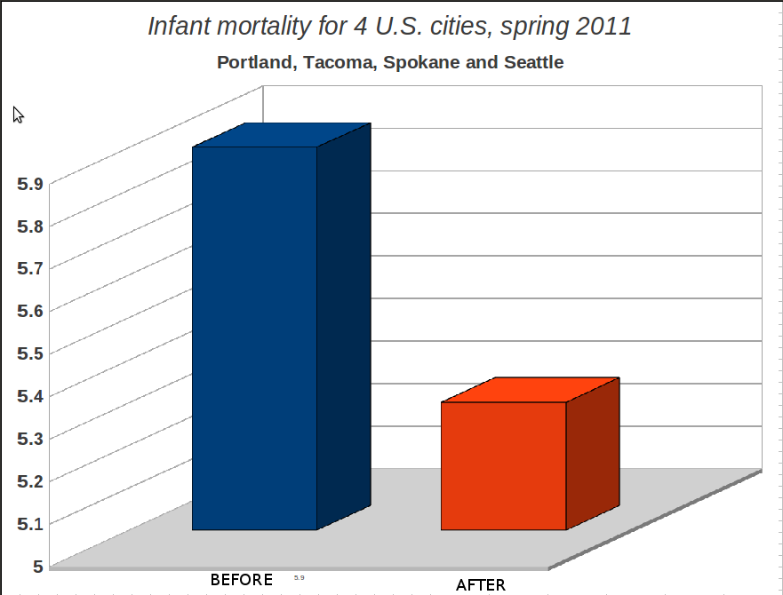
This is, of course, a very dishonest way of plotting things if you want to show the whole picture, but if Joseph Mangano can do it, they why shouldn’t we? The main point is anyhow clear, there is no increase in infant mortality in the United States of America due to Fukushima. Got it? And if there is, we will no find out through sloppy analysis by charlatans like Sherman and Mangano. And, as it seems, not through the statistics consultants that muck-raking journal CounterPunch is using. It will take careful analysis by serious researchers to find out if there is any real effect. If they would bother to start looking. But Mangano said in the Fox News interview
:
this is a red flag to raise for more studies to be done
Actually, he is right. It is a red flag to raise for careful scrutiny of all the earlier work by Sherman, Mangano, and their alarmistic friends. Some of their earlier studies have become “common knowledge” in anti-nuclear groups. Last year we had a member of the green party in Sweden standing in the parliament during a debate about nuclear power, where he referred to studies of increased childhood leukemia, authored by Sherman and Mangano, and of course the Chernobyl book edited by Sherman. Maybe we all can move on with life and more pressing issues now, ok? Those who want to hang on to all bad things with Fukushima still have plenty of material to work on. But stick to the facts, please. Ok? Two questions remain:
- Why is Alexander Cockburn’s editorial so forgiving towards Sherman and Mangano? If I had been the editor of a journal, I would be furious if it turns out that some authors make fools of themselves, and of me as an editor, by cheating with data, and I would make sure that they were never to publish anything more in my journal. Ever. Especially when it comes to such an important issue that worries millions of people, not the least parents of small children. But Cockburn is so happy to have, through Sprey’s re-analysis, found that there was indeed an increase, so Sherman and Mangano was right even if they cheated, no shadow should fall upon them. After all, CounterPunch is a muck-raking newsletter with a radical attitude, so there must be some muck to find, and indeed they found it. But when it now turns out that not even this was right, what will he write in the next editorial? “We follow proudly in the sensationalist footsteps of William Randolph Hearst!” or what? We have already established that Janette Sherman and Joseph Mangano should be very ashamed of themselves. If I was Alexander Cockburn I would at least be quite embarrassed.
- What went wrong in Sprey’s re-analysis?
An email has been sent to Alexander Cockburn, requesting that they do a muck-raking investigation of the skills of their statistical consultant. Furthermore, CounterPunch now has a great opportunity to recover their lost credibility; How about a couple of articles with in depth investigations of the earlier works of Janette Sherman and Joseph Mangano? This could be the starting point in a long series of muck-raking articles where all the controversial statements from the anti-nuclear icons are carefully scrutinized, could it be that there are more “common truths” out there that are based on the same weak evidence (i.e. none) as in the present case? Alexander Cockburn, are you up to the task?
Mattias Lantz – member of the independent network Nuclear Power Yes Please
P.S. What about Seattle? Some observant persons may have noticed from the table above that Seattle does have an increase in infant mortality by a factor 3 between week 11 (2 deaths) and week 12 (6 cases). At least Seattle has an effect due to Fukushima, pretty please? Well, I’ll give you the plot for Seattle:
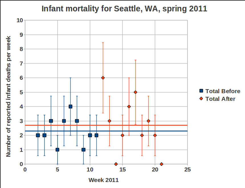
6 cases the week that the radioactivity reached Seattle, compared to 2 the week before, that must be significant! If you still insist on this kind of reasoning, it means that you somehow have ignored the plots I show here and here. Still not convinced? Then go to the CDC data base and pick out the numbers for yourself, and please do not forget to check the pattern for Seattle week by week for earlier years. Here are the links to the CDC data base, instructions for some of them are found if you place the pointer over the link. I recommend to start with the last one, it is the easiest to handle:
http://www.cdc.gov/mmwr/mmwr_wk/wk_cvol.html
http://www.cdc.gov/mmwr/preview/mmwrhtml/mm6010md.htm?s_cid=mm6010md_w#tab3
http://wonder.cdc.gov/mmwr/mmwrmort.asp
10 Comments
The previous post was written in a rush, and somewhat in anger. Here is an attempt to explain better.

It seems as if it wasn’t enough for Joe Mangano to spread fear in the northwestern part of the U.S., so he decided to play the same game for Philadelphia, PA. One reason may be that relatively high levels of Iodine-131 in water have been recorded there recently. These are of course reasons for concern, and several reasons have been suggested (see for instance here(1), here(2) and here(3))
We leave that discussion aside and focus on Mangano’s new claims. For Philadelphia he suggests that a 48% increase of infant mortality is due to Fukushima. Below is the very detailed graphics (n.b.: irony) of the weekly rate of infant mortality before and after the radiation from Fukushima reached Philadelphia. The picture is a screen dump from the Fox News interview.
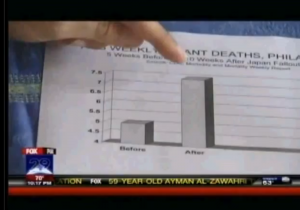
Please note that is not enough for Mangano to cherry-pick the data, he is also keen on making the increase look very high by cutting the scale at 4, thus the “After”-pillar looks three times larger than the “Before”-pillar. Oh well, let’s not stay sore over that, we go back to his claims.
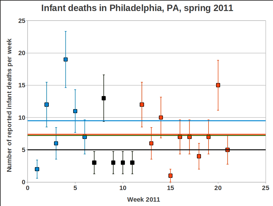
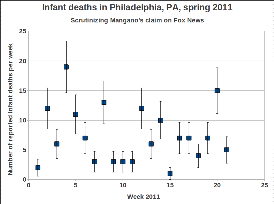
Mangano’s “Before”-pillar corresponds to weeks 7 to 11 (black boxes). For the northwest Sherman and Mangano used weeks 8-11, now it seemed important to bring down the average value by adding week 7 in order to reduce the effect of the high value for week 8. The average becomes 5.0, to be compared with the ten following weeks (week 12-21) which have an average of 7.4. This is 48% higher value, just as Mangano says.
But once again, if we look at the first 6 weeks of the year, we find that the average for that period is 9.5! And the average value for the first 21 weeks of 2011 is 7.42, i.e. slightly higher than the alarming 48% increase level that gave Mangano a few minutes on fame on TV. In other words, Joe is trying to take us for a ride again. shame on him.
During the interview with Fox News he says, among other things:
The real benefit is that this is a red flag to raise for more studies to be done.
and
Is this a fluke or is there some other reason?We’ll see, but we can’t rule out Japan. Its too…too distinct.
The talk about a red flag could be a valid argument if data were more convincning. But the data only becomes “…too distinct” if we allow Mangano to play his tricks with them, i.e. by not showing a longer time trend before Fukushima. But there is a red flag to raise, a warning flag that Joseph Mangano is not a man to trust in these matters. And if he has done this, what says that any of his earlier studies have been performed in a more honest way.
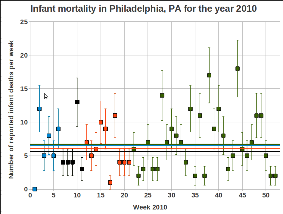
During the Fox News interview Mangano also claims that the data from CDC shows a decreasing trend for the corresponding weeks during the previous six years, and now after Fukushima we have a peak instead. Based on what we have seen above, this is a meaningless statement. My intention was to double check all the data for the last six years, but it takes some time to extract the data from the CDC data base and I have better things to do. Therefore I only show the data for 2010, with the same weeks marked for comparison.
The mean values for the different time periods are:
- Weeks 1-6: 6.5 (9.5 for 2011)
- Weeks 7-11: 5.6 (5.0 for 2011)
- Weeks 12-21: 6.1 (7.4 for 2011)
- Weeks 1-21: 6.1 (7.43 for 2011)
- Weeks 1-52: 6.7 (answer for 2011 will come in January 2012)
So, just by comparing weeks 12-21 between 2010 and 2011 we see that yes, there is an increase for 2011, and Mangano may be correct about a decreasing trend for the years 2005-2010. But considering the great variation in data over the last year this does not indicate anything. There are many other things that Mangano would have to explain then as well, for instance why 7.4 infant deaths are of concern while 9.5 is not. Ah, silly me, a relatively high value is only important if there has been a nuclear accident during that time. Who am I to question that? 😉
Mattias Lantz – member on the independent network Nuclear Power Yes Please
Update 25 June 2011
Several persons have asked about how to get access to the raw data. I put a summary of the links I have used on the follow-up post regarding the strange results from the CounterPunch re-analysis of the data (here), but I will now put them here as well. The last link on the list is the one that is the easiest one to use. Some information will appear if you hold the pointer over each link:
http://www.cdc.gov/mmwr/mmwr_wk/wk_cvol.html
http://www.cdc.gov/mmwr/preview/mmwrhtml/mm6010md.htm?s_cid=mm6010md_w#tab3
http://wonder.cdc.gov/mmwr/mmwrmort.asp
12 Comments
It turns out that Joseph Mangano is trying to pull the same stunt by claiming a 47% increase of infant mortality in Philadelphia, PA, after Fukushima.
And here is a quick plotting of the data, I leave it to the readers to figure out the consequences of only using weeks 7 to 11 for comparison with the ten weeks after that.
There is only one word for this: BULLSHIT!
/Mattias Lantz
Comments closedOn several web sites there has recently been references to an article published on the web site Counterpunch with the title “Is the Dramatic Increase in Baby Deaths in the US a Result of Fukushima Fallout? – A 35% Spike in Infant Mortality in Northwest Cities Since Meltdown“.
The article, published on 10 June 2011, is authored by Janette D. Sherman and Joseph Mangano, both renowned persons in the anti-nuclear movement. In the text the authors claim a statistically significant increase of infant mortality deaths with 35% after the Fukushima accident in eight selected cities on the U.S. west coast.
They write
The recent CDC Morbidity and Mortality Weekly Report indicates that eight cities in the northwest U.S. (Boise ID, Seattle WA, Portland OR, plus the northern California cities of Santa Cruz, Sacramento, San Francisco, San Jose, and Berkeley) reported the following data on deaths among those younger than one year of age:
4 weeks ending March 19, 2011 – 37 deaths (avg. 9.25 per week)
10 weeks ending May 28, 2011 – 125 deaths (avg.12.50 per week)
This amounts to an increase of 35% (the total for the entire U.S. rose about 2.3%), and is statistically significant. Of further significance is that those dates include the four weeks before and the ten weeks after the Fukushima Nuclear Power Plant disaster.
Furthermore, they try to link the releases of radioactivity from Fukushima and Chernobyl to the relatively high infant mortality rate in the U.S. A look at the data used by Sherman and Mangano does indeed seem to indicate an increase in the number of infant deaths in northwest U.S. after Fukushima, see the plot below:
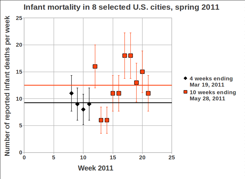
The Fukushima events started on March 11, i.e. by the end of week 10. Then it took slightly more than a week for the first release of radioactivity to reach the nortwest part of the U.S. The data do show an increased infant mortality rate after Fukushima. The black line shows the average value for the 4 weeks before March 19, and the orange line shows the average value for the 10 weeks after that. The error bars on each data point indicate the statistical uncertainties.
But why are the 10 weeks after Fukushima compared with only 4 weeks before? There seems to be a reason for it, commonly referred to as cherry-picking, i.e. you select the data that supports your theory without showing the full picture. To show the full data set may falsify what you want to show. This is quite common in politics and by people who have an agenda that is more important than the truth. But here we have two persons in medicine, one Medical Doctor and one Master of Public Health, they should be trustworthy professionals who are keen on giving people honest information, right? Let’s check their deck of cards closer.
So, if we include data for, say, the first 7 weeks of 2011, we get a very different idea about the situation:
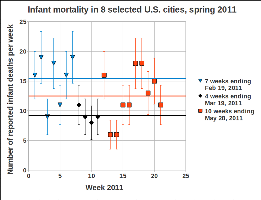
Very interesting, the first seven weeks of 2011 actually has higher infant mortality than the weeks after Fukushima, quite different from what Sherman and Mangano wants us to believe. There is no spike after Fukushima, instead there is a dip during the 4 weeks before! A more detailed report on the closer scrutiny of Sherman and Mangano’s article is found in our Deep Repository.
So, why does a Medical Doctor mistreat official data in this way? It is quite remarkable, and embarrasing, especially since Janette Sherman writes about herself on her web page (http://janettesherman.com/about/):
Dr. Sherman’s primary interest is the prevention of illness through public education and patient awareness.
She seems to have forgotten about her primary interest in this case, I fail to see how cherry-picking data can be part of public education and public awareness. And if anybody can see how you can prevent illness through scaring people with false statistics, then please explain it to me. Embarrasing, Janette Sherman…
Joseph Mangano already has a track record of handling data in not so honest ways, we may come back to that in other blog entries (a few links to examples, as requested by a commenter: http://neinuclearnotes.blogspot.com/2005/08/joseph-mangano-and-art-of-deception.html and http://www.nei.org/resourcesandstats/documentlibrary/safetyandsecurity/factsheet/scienceonradiationhealtheffectsdispelstoothfairyproject/).
What baffles me the most is that he and Sherman try to get away with this alarmistic claim by such a lousy handling of official data. Anybody can easily check it for themselves and see that Sherman and Mangano are wilfully interpreting data so that they agree with their already decided view on things. What is worse, they are scaring a lot of people with their claims, for no reason at all. Therefore: Shame on you!
/Mattias Lantz – member of the network Nuclear Power Yes Please
Follow-up blog entries on the same subject
19 June 2011: More bullshit from Joseph Mangano, take 2
21 June 2011: CounterPunch verifies infant mortality was alarmism but seems keen to create more of it
27 July 2011: Sherman & Mangano admits errors – or do they?
21 December 2011: 3 strikes and you’re out! Sherman & Mangano does it again…
29 August 2012: Joseph Mangano never stops, and he never gets it right
Update 24 June 2011
Several other people have scrutinized the Sherman-Mangano joke (by now I do not want to mis-use the word “study” in connection with these people), most notably in Scientific American. Here is a list:
- Scientific American, “Observations” blog, by Michael Moyer, 21 June 2011: “Are Babies Dying in the Pacific Northwest Due to Fukushima? A Look at the Numbers”
- The sei-uno-zero-nove (6109) blog, by Antonio Rinaldi, 21 June 2011: “e-nucleare disinformazione” (in Italian)
- The xkcd forum, user signatures ++$_ and endolith, 16 June, under the post “8.8 Earthquake hits 250 miles from Tokyo”
- The Cliff Mass Weather Blog, 17 June 2011: “Fukushima Radiation and Infant Mortality in the NW? No way” (borrowing our plots)
- Chris Mooney on the Discover Magazine blog, 17 June 2011: “Nuke Scaremongering and the Left”
- U.C. Berkeley, Department of Nuclear Engineering, Berkeley Radiological Air and Water Monitoring Forum (comments in all directions, but a couple of people are checking the data for themselves): “Fukushima fallout caused significant increase in baby deaths?” and “Post-Fukushima Infant Deaths in the Pacific Northwest Update.”
- My colleague Andrea Mattera have translated this post into Italian and it has been posted as a comment on the Come don Chisciotte web page, 18 June 2011: “PICCO DEL 35% DI MORTALITÀ INFANTILE DOPO L’INCIDENTE DI FUKUSHIMA” (in Italian)
- Mike, a physics student from Victoria (Canada?) have checked the data for himself, they are available here. (Mike linked to his data from the discussion on the Unsilent Generation blog post: “Infant Mortality on Pacific Coast Jumped after Fukushima”
- The Buzz Blog on Physics Central comments on the scrutiny done in Scientific American and asks the question why Sherman and Mangano is doing this nonsense: “Beware the Evil Scientists”
- The uvdiv blog has a guest post by Alexey Goldin that hopefully is enjoyable also for non-statistics nerds, and he shows data for several years back: A curious case of cherry-picking data for the greater good. I can only agree with his final statement: “At this point it is worthwhile to question either the scientific integrity or statistical competence of Sherman and Mangano. They might be decent people and believe in what they say, but allow themselves to say “small lies” in a service of “Greater Truth”. This never ends up well. Because they are likely to kill some unstable people with their small lies.“
- The newspaper Hawaii Reporter has an article about it by guest writer Michael R. Fox, 5 July 2011: Anti-Nuclear Fictions Continue
- British Columbia Centre for Disease Control have issued a comment both on the S&M joke, and the increase of infant mortality in British Columbia this spring. The latter effect is real, and was a great concern for the authorities (although media reported it in a bit scandalous manner by comparing only with last year when the infant mortality for the region was unusually low). It turns out that the unusually high level is the same for the time period before Fukushima as in the time period after, so any alarmist should better look for other things to scare with: http://www.bccdc.ca/NR/rdonlyres/5B6E918D-F306-4842-8EC9-32EBD4149715/0/infant_mortality_response.pdf
- Hank Campbell writes on the Science 2.0 web site: Anti-Science Beliefs: Babies Dying in the Pacific Northwest Due to Fukushima
- …(to be updated)
Update 25 June 2011
Several persons have asked about how to get access to the raw data. I put a summary of the links I have used on the follow-up post regarding the strange results from the CounterPunch re-analysis of the data (here), but I will now put them here as well. The last link on the list is the one that is the easiest one to use. Some information will appear if you hold the pointer over each link:
http://www.cdc.gov/mmwr/mmwr_wk/wk_cvol.html
http://www.cdc.gov/mmwr/preview/mmwrhtml/mm6010md.htm?s_cid=mm6010md_w#tab3
http://wonder.cdc.gov/mmwr/mmwrmort.asp
61 Comments
