Last updated on March 1, 2013
The previous post was written in a rush, and somewhat in anger. Here is an attempt to explain better.

It seems as if it wasn’t enough for Joe Mangano to spread fear in the northwestern part of the U.S., so he decided to play the same game for Philadelphia, PA. One reason may be that relatively high levels of Iodine-131 in water have been recorded there recently. These are of course reasons for concern, and several reasons have been suggested (see for instance here(1), here(2) and here(3))
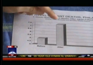
We leave that discussion aside and focus on Mangano’s new claims. For Philadelphia he suggests that a 48% increase of infant mortality is due to Fukushima. Below is the very detailed graphics (n.b.: irony) of the weekly rate of infant mortality before and after the radiation from Fukushima reached Philadelphia. The picture is a screen dump from the Fox News interview.

Please note that is not enough for Mangano to cherry-pick the data, he is also keen on making the increase look very high by cutting the scale at 4, thus the “After”-pillar looks three times larger than the “Before”-pillar. Oh well, let’s not stay sore over that, we go back to his claims.

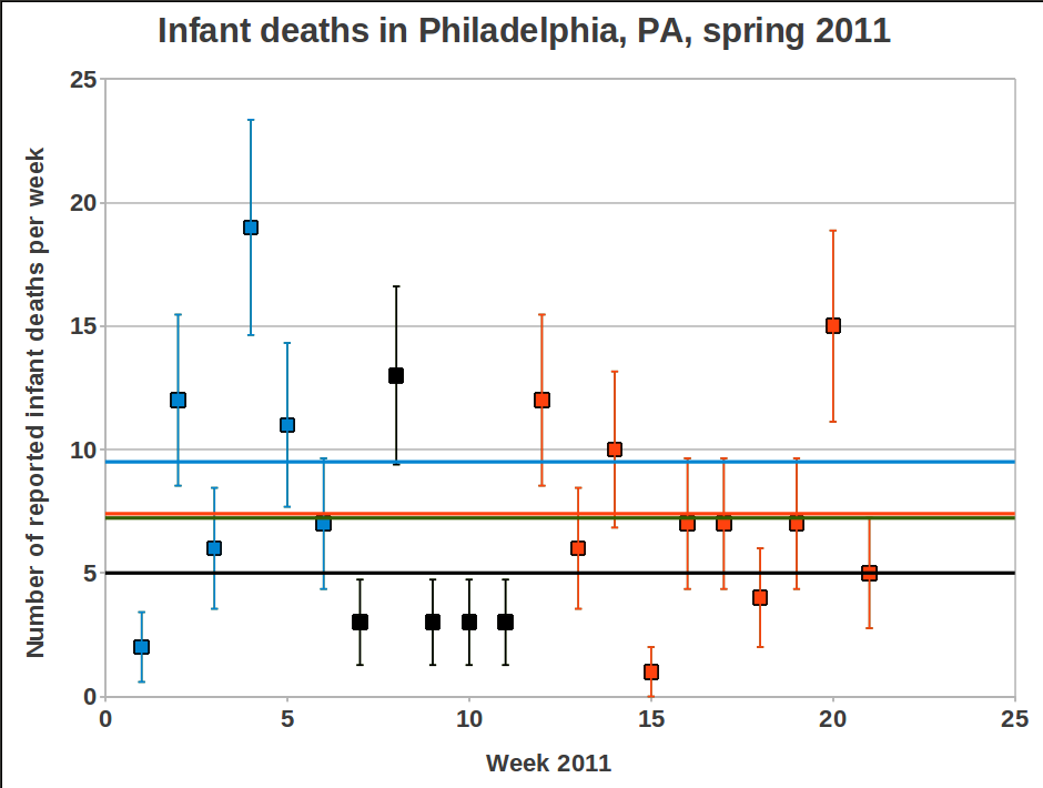
Mangano’s “Before”-pillar corresponds to weeks 7 to 11 (black boxes). For the northwest Sherman and Mangano used weeks 8-11, now it seemed important to bring down the average value by adding week 7 in order to reduce the effect of the high value for week 8. The average becomes 5.0, to be compared with the ten following weeks (week 12-21) which have an average of 7.4. This is 48% higher value, just as Mangano says.
But once again, if we look at the first 6 weeks of the year, we find that the average for that period is 9.5! And the average value for the first 21 weeks of 2011 is 7.42, i.e. slightly higher than the alarming 48% increase level that gave Mangano a few minutes on fame on TV. In other words, Joe is trying to take us for a ride again. shame on him.
During the interview with Fox News he says, among other things:
The real benefit is that this is a red flag to raise for more studies to be done.
and
Is this a fluke or is there some other reason?We’ll see, but we can’t rule out Japan. Its too…too distinct.
The talk about a red flag could be a valid argument if data were more convincning. But the data only becomes “…too distinct” if we allow Mangano to play his tricks with them, i.e. by not showing a longer time trend before Fukushima. But there is a red flag to raise, a warning flag that Joseph Mangano is not a man to trust in these matters. And if he has done this, what says that any of his earlier studies have been performed in a more honest way.
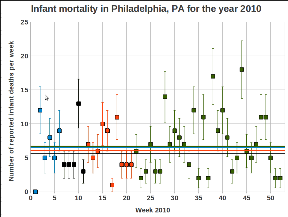
During the Fox News interview Mangano also claims that the data from CDC shows a decreasing trend for the corresponding weeks during the previous six years, and now after Fukushima we have a peak instead. Based on what we have seen above, this is a meaningless statement. My intention was to double check all the data for the last six years, but it takes some time to extract the data from the CDC data base and I have better things to do. Therefore I only show the data for 2010, with the same weeks marked for comparison.
The mean values for the different time periods are:
- Weeks 1-6: 6.5 (9.5 for 2011)
- Weeks 7-11: 5.6 (5.0 for 2011)
- Weeks 12-21: 6.1 (7.4 for 2011)
- Weeks 1-21: 6.1 (7.43 for 2011)
- Weeks 1-52: 6.7 (answer for 2011 will come in January 2012)
So, just by comparing weeks 12-21 between 2010 and 2011 we see that yes, there is an increase for 2011, and Mangano may be correct about a decreasing trend for the years 2005-2010. But considering the great variation in data over the last year this does not indicate anything. There are many other things that Mangano would have to explain then as well, for instance why 7.4 infant deaths are of concern while 9.5 is not. Ah, silly me, a relatively high value is only important if there has been a nuclear accident during that time. Who am I to question that? 😉
Mattias Lantz – member on the independent network Nuclear Power Yes Please
Update 25 June 2011
Several persons have asked about how to get access to the raw data. I put a summary of the links I have used on the follow-up post regarding the strange results from the CounterPunch re-analysis of the data (here), but I will now put them here as well. The last link on the list is the one that is the easiest one to use. Some information will appear if you hold the pointer over each link:
http://www.cdc.gov/mmwr/mmwr_wk/wk_cvol.html
http://www.cdc.gov/mmwr/preview/mmwrhtml/mm6010md.htm?s_cid=mm6010md_w#tab3
http://wonder.cdc.gov/mmwr/mmwrmort.asp


Warning: Declaration of Social_Walker_Comment::start_lvl(&$output, $depth, $args) should be compatible with Walker_Comment::start_lvl(&$output, $depth = 0, $args = Array) in /var/www/nuclearpoweryesplease.org/public_html/blog/wp-content/plugins/social/lib/social/walker/comment.php on line 18
Warning: Declaration of Social_Walker_Comment::end_lvl(&$output, $depth, $args) should be compatible with Walker_Comment::end_lvl(&$output, $depth = 0, $args = Array) in /var/www/nuclearpoweryesplease.org/public_html/blog/wp-content/plugins/social/lib/social/walker/comment.php on line 42
Typical Mangano snake oil.
Now, who do you think pays his salary?
[…] dödsfall istället. Det kommer inte dröja länge innan vi ser Mangano’s (länk 1, länk 2, länk 3) slask dyka upp i en vänster eller grön blogg i din närhet, tex Svensson, Kommunisterna, Jinge, […]
Considering Magano … and Romm … and Stalin too, come to think of it, I’m considering changing my first name (Joseph).
Much to think about in Lanzelot´s different analyses!Inspiring! People play with existing easily available public statistic information by a variable amount of creative selection, and find brave new interpretations! Not just Mangano and Sherman, but also Busby in earlier essays on this site (e.g. http://nuclearpoweryesplease.org/forum/viewtopic.php?f=16&t=109). As it seems popular to draw conclusions from pieces of existing statistics connecting nuclear with health, I made also a try in this art. Lanzelot used the Gapminder tool (http://www.gapminder.org/world/), which was developed by Hans Rosling mainly for health analyses. So I applied it to nuclear related health! Some of the studies discussed have claimed statistical significance, but on so doubtful grounds, that I conclude significance tests are not required in this art of data management, they are just mentioned to appear politically correct. My analyze was limited to countries with a high GDP (GDP >25000$/person=income; to avoid health problems related to poverty) and with rather much nuclear power (>0.7 (an oil equivalent index); to avoid countries, where use of nuclear power may be seriously hampered by strange variants of local opinions). The list of considered countries comprised: Belgium, Canada, Finland, France, Sweden, Switzerland and USA. US was bottom-ranking for nuclear power and life expectancy, but top-ranking for income, CO2 emissions, sulfur emissions, child mortality (both ages <6 and <1) and maternity mortality.These data invited to an explanation and a suggested solution. To absorb the high income, the US has been forced to produce goods causing high emissions, as US got insufficient access to nuclear power for emission free production. The high emissions are likely to cause the observed shortcomings in health. This explanation fits well with the observations noted in the previous paragraph. The solution to the US health problems seems to be increasing nuclear power!There may be another explanation. Enthusiasts of nuclear power like to point out that there are observations indicating that low doses of radiation may have a positive effect on health (http://www.chemeurope.com/en/encyclopedia/Radiation_hormesis.html). The current observations connecting insufficient nuclear power and poor health strengthens this hypothesis, as commercial reactors are assumed to expose the population to low doses only. Even in the cases with severe accidents vanishingly few get exposed to more than low doses.I made the reasoning above to see how I feel passing the border to scientific decency.
Hi Dag, is there a link to your Gapminder-game? (I made one in the forum post, I guess it should be possible with for your test as well, or?)
Personally I would be very cautious with the hormesis argument, there seem to several effects, both beneficial and benevolent. And the results are pointing in both directions depending on what you look at and how you measure. But it is indeed an interesting field for research.
Hi Lantzelot
You mean like this http://www.bit.ly/jqDTOJ ?
I though it was rather easy to feed gapminder data.
If you read my last sentence you see that I am not quite serious but play a little to get a better understanding on how results and persons you so detailed and cleverly critize may arize.
In particular it is rather insane that there should be a detectable difference in one way or another in national health caused by different amounts of radiation depending on the extent nuclear power is used and that this should say something about hormesis.
I do not see what you meant that results are pointing in both directions. That US is extreme in considered characters among listed nations seems to me to point in one direction only. Even if intentionally misleading with my wording!
Thanks Dag!
I was lazy (have had enough of going through the CDC data base during the last week…), so a direct link that includes your settings is exactly what I was asking for. 🙂
Regarding hormesis I did not mean specifically in relation to your Gapminder-game, but in general. As you point out many pro-nuclear people refer to radiation hormesis effects as if it was an established fact. Your link gives some good information on this, and there are a number of interesting “evidence” in favour of it. But even the term “hormesis” is a gross over-simplification when it is in fact a number of different effects that seem to work in both directions. I am not fluent in this subject and leave it to the experts, I just want to advice caution in referring to it as an excuse to not worry about enhanced radiation levels.
But for the present discussion, I seem to have forgotten about the last sentence in your first comment. 🙂
With your Gapminder game one can draw a number of more or less credible conclusions, for instance that the life expectancy in Sweden would increase to the level of Japan if we reduce the amount of nuclear power to a third of today’s level. But if we decrease it more, or just with about 50%, then we will reduce the life expectancy. Nonsense arguments of course, but I am learning quickly from our teachers Sherman and Mangano…
Nuclear is not the only important explanation for good health (if nuclear should have that effect), even NPYP should have a humble attitude to that. Wherefore I restricted the analyses to variations among countries where nuclear IS important, although to a varying degree. Japan was below that line. Looking on all countries, where is a very clear picture that health is generally better in countries with much nuclear, but if you only look among countries with little or no nuclear, this pattern become less transparent.
The data point more in the direction that the Japanese health would raise still more if they trebbled their nuclear programme:-)
Now you understand me right, some playing with data might be useful, even if not directly trustworthy, it depends on how it is done and formulated. Some people you critizise now seems to have passed beyond a border, which decrease their trustworthiness.
My recommendation is that pro-nuclear people should not over-interpret hormesis. The most trustworthy bodies do not suggest that low doses are harmless. Leave the detailed discussion to the more professional radiobiologists, it is a lot of funny things going on, but mostly of “academic” interest. Forty years ago I thought about these things based (among other) on results I produced myself for doses close to the spontaneous, from that point of view I belong to the most experienced 0.01 % of the population.
You can see radiation as shooting at people in a crowd. Some bullets hit a vital organ and kill at one shoot. If you fire at a low speed the kills will be proportional to the number of shots. At higher firing speed the shots start to interact, and when more people may be killed by the accumulated effect of several wounds. There may be still more complicated interactions, people may start to dress bullet proof wests etc. All bullets are not the same, neither are all people. Etc etc.
An educated guess is that with a small increase in the spontaneous rate still we still are in the linear part when evaluating main effects. But the most relevant results are from higher doses, so it is a question how to “extrapolate” down to low doses. The most important bodies are not suggesting linearity here. Was this understandable? I think your current explanation is rather well-formulated.
So, if I understand you correctly, we are basically saying the same thing.
Something about numbers and fractions when comparing with population statistics. As you like to play with figures.
Say that Fukushima will shorten the life of 4000 Japanese by 10 years (cancer and other radiation induced desease) during around 40 years to come. That can be seen as an overmortality during 40 years of 4000 among 40 millions who die “normally”. Realistic scenario in my opinion. That is 4 000/40 000 000 = 0.0001 =0.01%. You would see it in general death statistics as an increased mortality of 0.01%. The mortality does not occur equally. Say that it is over-represented by a factor 100 in e.g. infant death the first year, it would still only be 1 % increase, not 30%. This is of course in Japan, the exposure in US must be many magnitudes lower. Thus the observations you talk about are many orders of magnitudes too high, it is rather meaningless to search more or less at random in general health statistics.
If 4000 Japanese get their life shortened by 10 years among 100 000 000 Japanese that means 40 000/100 000 000 = 4/10 000 = 0.0004 years = 0.1 day life shortening for the Japanese population. The expected life time is several years longer in Japan than in Sweden. It is needed a Fukushima a week to reduce the Japanese health to that of Sweden.
I have not checked this, it may be some error. But it may inspire you to further number exersizes. But I guess you enjoy more to critisize evident rather foolish overestimates than speculating around an assumption about a possible considerable death toll following Fukushima.
I love Mangano’s graphic. It’s like a page out of that old classic How to Lie with Statistics. The book covers the exact technique that he uses.
Of course, considering the poverty of information in that graphic, it’s also reminiscent of this notable slide.
😀
It took me a while to figure out what it was about, excellent!