All we have to fear is fear itself, not the fearmongers who spread it
Chris Busby
The outcome of the events in Fukushima are far from over, and there are many facts that will take years before they become available. There are a number of things that can be handled better, not the least the flow of information from TEPCO and Japanese authorities.
Arnie Gundersen
Meanwhile, the suffering, fears and worries of the people affected is made even worse than it need to be, thanks to a number of fearmongers who exaggerate the effects.
Helen Caldicott
We will not speculate here about the motivations of the fearmongers, some of them surely believe in what they are saying, even when proven wrong. Some of them seem to have a need to inflate their resumees, or refer to what sounds like scientific reasoning in order to impress people. And some of them claim to speak from a higher moral ground.
Leuren Moret
They may be right about a number of things, and sometimes they have correct things mixed into their gospel. But the main objective of it is not to give us good advice and proper information, the objective is to scare you into thinking like them.
Joseph Mangano
The effects are clearly seen on a number of blogs and news sites, many times the commentary fields are full of discussions that completely have lost connection with reality. The fearmongers are referred to as trustworthy authorities in the field, no matter what crazy things that comes from their mouths.
Janette Sherman
Six months have passed since the events in Fukushima started. The first round goes to the fearmongers. They will surely continue with their dark gospels, in whatever forms they preach them. And we will have to counter more of their nonsense in the future. Only one thing is clear: We will not leave them unopposed.
Warning: The following text may contain personal attacks and wild speculations about certain people. This will not make any future attempts of dialogue with them any easier, but in my humble opinion they have had their chances.
By concentrating only on the CDC (Centers for Disease Control) data – incomplete at best – and ignoring the on-going radioactive releases from Fukushima, it is apparent that the pro-nuclear forces are alive and active.
Hey, wait a minute. It was not the pro-nuclear forces (whatever that is, but let’s embrace the term with a jolly “Fooorward!”) who started tampering with the CDC data in a way that would flunk any undergraduate student in Statistics 101, it was you, remember? This does not mean that we ignore the rest of the issue, but we do take offence when anti-nuclear forces fail to use the information from Fukushima to their advantage and have to cook up alarmistic results in order to make the situation look worse than it is. This is indeed very remarkable, aren’t the actual events in Fukushima bad enough for you?!?
If I had the mindset of S&M, I would write
By mis-treating the CDC data – incomplete at best – and ignoring all knowledge about radiation effects, and actual radiation levels in the US due to Fukushima, it is apparent that the anti-nuclear scaremongers are alive and active.
This is clearly not a way forward, at least not if you hope for a dialogue and an improvement of the nuclear debate. Oh well, let’s move on.
The second section explains that the titles of the previous articles (there are two versions, one in CounterPunch, and one in San Francisco Bay View) includes question marks in order to
stimulate interest and prompt demand for governments – Japan and the U. S. at least – to provide definitive and timely data about the levels of radioactivity in food, air and water.
Hm, Janette and Joe. May I kindly ask: Wouldn’t it be better to try to stimulate this interest in a way that does not include cherry-picking, unfounded alarmism that scares the heck out of millions of parents to infants, and a way of throwing random pieces of data around that should reduce whatever credibility you might have had before to a new low point?
Next section:
We received many responses, some in support of our concerns and some critical about how we used CDC data, including outright ad hominid attacks accusing us of scaremongering and deliberate fraud.
Oh really? I guess that I personally have to plead guilty to this charge, but they link to the blog entry by Michael Moyer in Scientific American as an example of an ad hominid attack. I re-read Moyers scrutiny of the CounterPunch article, but fail to see any personal attacks there. Ok, he uses words like “scaremongering”, “froth up”, “data fixing”, “critically flawed – if not deliberate mistruths”. Still, Moyer attacks S&M’s actions, not their personal traits.
Or do S&M really mean ad hominid attacks? My first assumption was that they mixed up “ad hominem” and “ad hominid“, but maybe they do know the difference? I bring the rest of us up to date by quoting the text on this link: “The former [ad hominem] is a criticism of a particular person; the latter [ad hominid] is a commentary upon a species.” So, have Moyer, myself, or anybody else involved in this issue, referred to S&M as neanderthals, platypus, or similar? Not that I can see, but it could be an interesting path to digress upon. Anyhow: Sensitive bunch, those scaremongers…
Now it becomes interesting:
Given the fallibility of humankind, we may have erred, and if so, will admit it. Given the delay in collecting data and the incompleteness of the collection, the criticism may be valid. MMWR (CDC’s Morbidity and Mortality Weekly Report) death reports have certain limits – representing only 30 percent of all U.S. deaths. They list deaths by place of occurrence, while final statistics are place of residence and deaths by the week the report is filed to the local health department, rather than date of death. Finally, some cities do not submit reports for all weeks. The CDC data are available at http://www.cdc.gov/mmwr/mmwr_wk/wk_cvol.html.
So, they admit that they may have erred, or do they say that they may admit it if proven to be the case? Or…? I am not sure, but this is probably as close to admitting anything that they will ever be. It is of course not their fault, it is the limitations of the CDC data that we should put the blame on, not a second thought about their method.
My first interpretation from reading the section is that they admit to that the statement in the first articles about a statistically significant 35% increase in infant deaths may not be correct (no matter who to blame). Unfortunately, it turns out that I am severely mistaken in my interpretation:
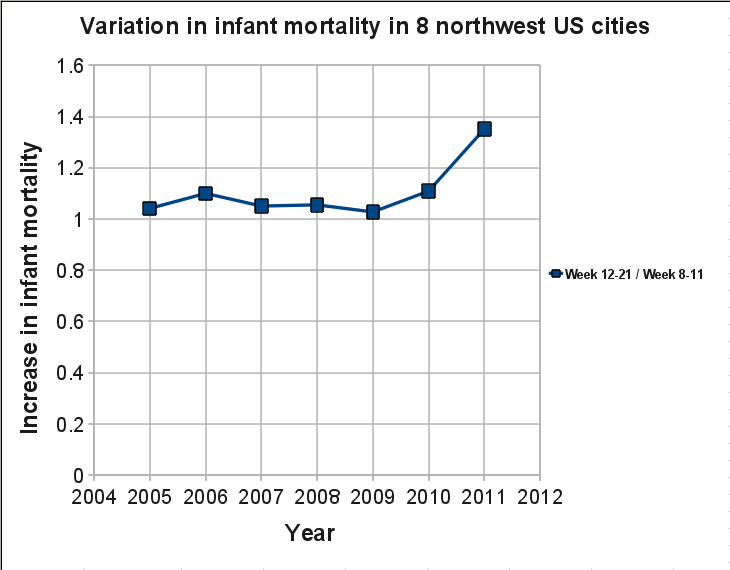
Since the article was originally published, we have had the chance to further analyze the CDC data. Historically, the change in infant deaths for the previous six years in eight Pacific Northwest cities from weeks 8-11 (pre-Fukushima) to weeks 12-21 (post-Fukushima) is about 6 percent – never above 11 percent. But in 2011, the change was 35 percent, far above anything ever experienced.
The same eight cities, the same comparison – four weeks 8-11 vs. 10 weeks 12-21 infant deaths:
2005 +4.1 percent
2006 +10.0 percent
2007 +5.1 percent
2008 +5.5 percent
2009 +2.8 percent
2010 +10.9 percent
The average for 2005-2010 is + 6.1 percent for a total of 1,249 infant deaths.
2011 +35.1 percent (162 infant deaths)
Before 2005, there were missing data. But the years 2005 to 2010 are about 98 percent complete.
Argh! Now I really do want to turn ad hominid on these people, whatever species (sparsis timoris?) they may belong to! First they say that maybe they were wrong and if so they maybe will admit it. Then they go on and make more “analysis” from the CDC data base, using the same lousy way of handling the data!
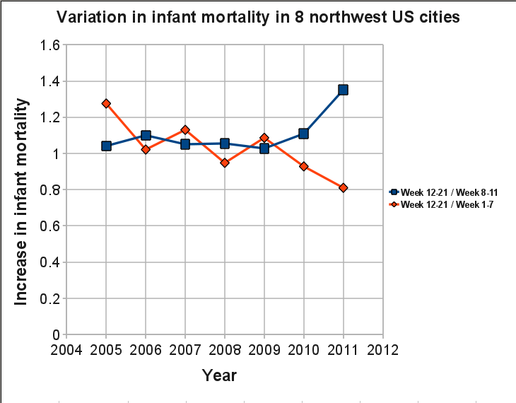
There has been plenty of text here, so let’s lighten up with a few plots, showing the CDC data S&M are mistreating. The plots from my previous posts about S&M should be enough for saying that this is rubbish, but one more round with the CDC data base will not hurt, in case that somebody still believes in S&M’s fables. We start with plotting the change in infant deaths between weeks 8-11 and weeks 12-21 for the years 2005-2011, i.e. the ones that S&M now claim to have done a more careful analysis on.
Change in infant deaths between weeks 8-11 and weeks 12-21 for the years 2005-2011
The blue squares show the data as given by S&M. Nothing wrong in the data, this is what you get when you do the same treatment as S&M, weeks 12-21 give a higher weekly infant mortality rate than weeks 8-11, with a few percent every year. Except for 2011 where the 35% increase looks really alarming. But we know from before that they have cherry picked the weeks by only using four weeks before Fukushima and 10 weeks after. If we also plot the ratio of weeks 12-21 over weeks 1-7, shown as red diamonds, we get the following trend:
Change in infant deaths, blue squares as in previous figure, red diamonds for weeks 1-7 and weeks 12-21
Quite interesting that there is a decreasing trend, and that the decrease is at its lowest level this year, a 20% reduction while it before usually was a slight increase (the 30% for 2005 is almost as much as the 35% that S&M have made so much noise about). In other words, if we compare the weeks after Fukushima with weeks 1-7, there seems to be a very beneficial effect on child mortality. Could it be that hot particles are beneficial for infants? This is rubbish, of course, but so is the question asked by S&M.
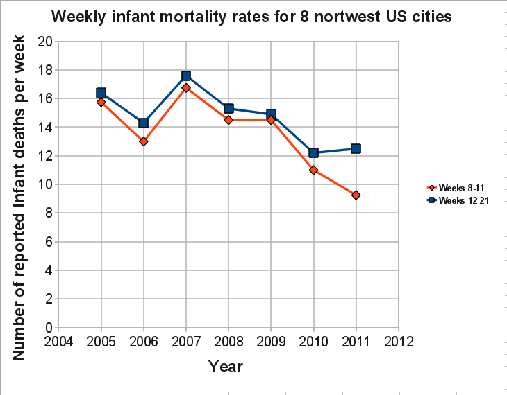
Still, why the drastic increase this year if they only used four weeks for the years 2005-2010 as well? And why does the results look completely opposite if we instead compare with weeks 1-7 instead of weeks 8-11. The answer is: statistical variations. We are watching random noise, not real trends due to a single cause that can be easily deduced. For this we need to look at longer time spans (for a start, we probably need to do a lot more as well, but let us not confuse the S&M-fans by introducing too much real scientific reasoning). But in order to understand the discepancy, we have to remember that they present the ratio between the two time periods, not the actual numbers. In the original articles S&M talks about increased infant mortality (you may remember that the articles start with “U.S. babies are dying at an increased rate.” Let’s take a look at this.
Number of infant deaths for weeks 8-11 and weeks 12-21
Now we see something interesting. Not only are the number of infant deaths for weeks 8-11 at an all time low during 2011, the number of infant deaths for weeks 12-21 are also at a very low level! U.S. babies are dying at an increased rate? I think not! S&M are shamelessly (if they really believe in their own conclusions then they are indeed very incompetent) showing results for relative numbers, not absolute numbers. Perfectly ok if you are honest with how you handle the data, can refrain from cherry picking the weeks and the areas, and do not suffer from an alarmistic version of Tourette’s syndrome. But S&M prefers to show a relative increase of 35% for this year, while the absolute numbers show a decrease when comparing with earlier years.
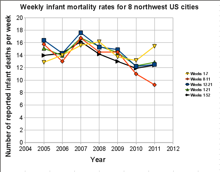
Still not convinced? Let us include weeks 1-7, weeks 1-21, and weeks 1-52 for each year. Please note that the value for 2011 in the weeks 1-52 (black line) only include the data for weeks 1-25, so it can change somewhat depending on the number of infant deaths that will occur during weeks 26-52 (S&M would probably be able to predict the future, I will not make any such attempts).
Number of infant deaths for weeks 1-7, 8-11, 12-21, 1-21 and 1-52
If anybody wants to pursue the idea that there is a drastic increase of infant deaths in northwest U.S. after Fukushima, that person will have many things to explain, for instance the drastic increase in infant mortality this year for weeks 1-7. The data does not support the idea of increased infant mortality due to Fukushima, no matter what S&M say.
One more quote from the article by S&M:
We acknowledge that many factors can cause infant deaths, but the critics who ignore Japanese fallout as possible contributing factors are acting irresponsibly.
So, cheating with the CDC data is a more responsible way to act? Nobody is ignoring the fallout. We are just fed up with false claims wrapped in an alarmistic package. Therefore I will, like many others, once again ignore everything else that is written in the S&M article; a mixture of some valid concerns that are heavily diluted with half-truths, advertisement about the Chernobyl book (edited by Sherman) and other reports (written by Mangano), scaremongering, claims about lies and cover up, and some more nonsense claims. It would be interesting to discuss the valid concerns that are addressed, but if we every time have to filter it out from a sea of myths then we would rather spend our time elsewhere.
Janette Sherman and Joseph Mangano: We do care about the consequences from Fukushima, many of them will surely be serious. Many of us are also annoyed by the lack of interest from the media to write properly about the present status. But we do not subscribe to your way of portraying it, as long as you show yourself unable to stick to the truth. Concerned citizens have nothing to learn from you. We do see the elephant in the room while you try to make it into a mammoth. May your methods and your dishonest claims suffer the same fate as this extinct species.
One final quote. In the beginning of the article there is a picture of a pretty baby, with the following figure caption:
Not only is it unthinkable to put our babies at risk by continued use of nuclear power plants, but infant mortality is an indication of an entire population’s health. When an unusual number of babies are dying, we are all at risk and must take a stand.
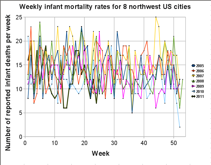
S&M must have plotted all the data from 2005 until now. If not, here I have done it for you:
Number of infant deaths per week for the years 2005-2011
Ok, I plot all years over each other, a bit messy. A better alternative would be to plot the years after each other, as done in this figure by Alexey Goldin in his entertaining statistics analysis of the S&M hoax. One may also try to see seasonal trends by plotting mean values for a number of years. In whatever way, S&M still owes us an explanation for their claim of an unusual number of babies that are dying. Can we close this chapter now, please?
Ad hominem/hominid attacks
I start to ask myself, are there Cliffs Notes for epidemiology? Is this how Mangano passed his courses for the MPH degree? Since my first encounter with Cliffs Notes about 20 years ago as foreign exchange student in the U.S., the company seems to have expanded its activities substantially, and are also available on the internet. At that time I was only aware of Cliffs Notes that cover novels that you are expected to read in school. If you are too lazy to read the novel, the Cliffs Notes gives a summary of the book, typical issues and questions that are likely to be on the exam (or good to be aware of if you want to pretend that you read the book and do not want to get expelled from the book-reading club), and a few other short cuts for the illiterate who still wants to graduate from high school. I find no Cliffs Notes for epidemiology, but there are indeed Cliffs Notes on statistics! Well Joe, if this is how you made it through college, please go back and read the following part:
In my first post on this subject the title was Shame on you, S&M! I should probably reconsider this title. If they had done this wilfully then I would stand my ground, but after reading their last article I get more and more convinced that it is just incompetence. They truly believe in what they are doing, and because they are victims of the Dunning-Kruger effect there is no way to make them understand that somewhere along the road they lost contact with reality. And just like Helen Caldicott, who in her debate with George Monbiot said “doctors can’t lie”, they are convinced that they speak from a higher moral ground.
So to tell somebody to be ashamed because they are incompetent in their field is about as useful as telling my 3-year old daughter to be ashamed for not knowing Bulgarian grammar. The difference is that my daughter may have a good chance to pick it up in a couple of years, if she would like to. For S&M, who have claimed expertise in their field for a long time, I see no hope at all. Maybe, just maybe, if they read Fooled by randomness by Nassim Nicholas Taleb, or some similar literature. They could really pick up some good lessons from a few chapters there. But it wouldn’t work, as far as I know Taleb’s books are not available in a Cliffs Notes format.
/Mattias Lantz – member of the independent network Nuclear Power Yes Please
Further comments
In the first post about S&M (here) I was criticized by a commenter for stating that Mangano has a track record of not handling data in an honest way, but I had not given any reference or link to back up this statement. That has been corrected and I have put two links in that post. But from now on it will be much easier. Three nonsense articles by Joe Mangano in slightly over two weeks, all three based on cherry picking. That is a track record as good (hrm, bad…) as any. To make it worse, good ol’ Joe has proudly put them on the RPHP web page:
And still no reaction from CounterPunch regarding their strange analysis
I have written twice to Alexander Cockburn, but have received no response. Instead there are a number of new articles that are critical of nuclear power of all kinds. Fine with me, but the lack of interest to get the strange re-analysis by Pierre Sprey corrected makes me wonder about the statement “Ours is muckraking with a radical attitude” . CounterPunch is certainly full of articles with a lot of attitude, but the muckraking seems to be missing.
For those on holiday but who cannot stay off the internet, below are a few Fukushima-related links to enjoy from the hammock:
TEPCO and the Japanese government announces that reactors 1-3 at Fukushima Daiichi now have reached the completion of the first step towards full stabilization, aiming for reaching the status “cold shutdown” by Januray 2012. There have (of course) been some setbacks, and some modifications on the schedule, but the work is continuing. More information in an understandable format (hardliners are welcome to try the TEPCO press releases) is given by Will Davis on the Atomic Power Review Blog.
A nice summary of the nuclear events at Fukushima Daiichi, as far as we know today, is given by Steve on The Neutron Economy blog.
The U.S. Nuclear Regulatory Commission (NRC) has released a report with proposed safety improvements at U.S. nuclear power plants in view of the events at Fukushima. More information, and a link to download the report, is given on the NRC blog.
När ungarna har tröttnat på Kolmårdens djurpark, eller inte accepterar ännu en fjällvandring, då kanske det är dags att utmana familjeidyllen med nya mål. För den som vill göra något annorlunda under semestern, varför inte besöka något av Sveriges kärnkraftverk i sommar?
Har du åsikter om kärnkraft och slutförvar men aldrig har besökt någon av anläggningarna? Vill du slipa dina argument för eller emot kärnkraft, ta chansen att lära dig mer om dessa härken under sommarledigheten. Man behöver inte gå med i Greenpeace för att kunna komma innanför stängslet (och man slipper dessutom påföljande rättsprocess). Flera av kärnkraftverken har besökscenter som är öppna nästan dagligen (se länkar nedan för öppettider, adresser och bokningsinfo), besök på vissa av anläggningarna kräver dock förbokning eller gruppbokning. Giltig legitimation brukar vara ett krav, och det brukar finnas en åldersgräns (12 eller 14 år) för besök inne på själva kraftverken. Besökscentren har dock ingen åldersgräns.
Vill du ha ett argument till? Det är gratis (dvs du betalar på elräkningen, så passa på att utnyttja möjligheten).
Forsmark och SFR
Biotestsjön vid Forsmarks kärnkraftverk
Här finns, förutom själva kärnkraftverket och biotestsjön, även möjlighet att bege sig ned i underjorden till SFR – slutförvaret för kortlivat radioaktivt avfall. Och när man tröttnat på kärnkraftsnörderiet kan man besöka Forsmarks bruk och andra vackra platser längs Upplandskusten.
Vid Ringhals kärnkraftverk finns ett bra besökscenter där både vuxna och barn kan lära sig massor om energifrågor och kärnkraft. Och sen finns hela Västkusten att njuta av.
OKG får priset för tråkigaste informationssida, och besök vid själva kraftstationen är begränsat till skolklasser och liknande studiebesök som bokas långt i förväg. Däremot finns det kärnkraftstutställning i Simpevarps by, och så förstås det närliggande Äspölaboratoriet. Småland och Öland är förstås andra lockelser.
Men vänta nu, är inte det kärnkraftverket nedlagt? Jo, men det står ännu kvar och används bland annat för utbildning av kärnkraftstekniker. För allmänheten finns förutom ett infocenter möjligheter till rundvandring i kärnkraftverket, troligtvis får man se mycket mer här än vid övriga kraftverk. Därefter kan man ta Öresundsbron över till Köpenhamn och likt Stig-Helmer i TV-serien “Riket” försöka hitta kärnkraftverket över sundet.
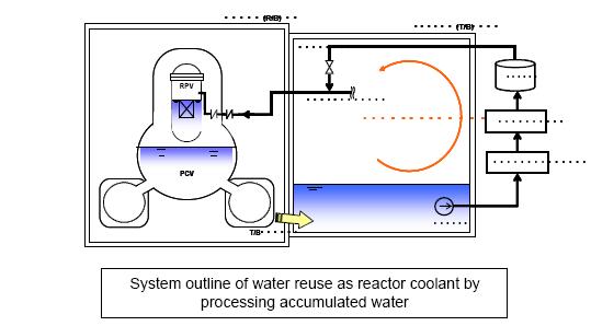
We are now over 3 months into the Fukushima accident, progress is creeping along at a steady pace. Since our last update there has been lots and lots of new and I won’t try to cover it all. The biggest news I want to share now is that TEPCO has gotten some kind of recirculation cooling working, it was reported today by Will Davis at Atomic Power Review(by far the best blog to keep an eye on for Fukushima news, I highly recommend to read it).
In short water is leaking out of the containment buildings into the turbine buildings, the water is pumped from the turbine buildings into the water treatment facility, then from there its pumped back into the reactor. Its like I described in the last update on may 18th (shown on the picture below) and one of the steps in the plan TEPCO released that month.
If everything goes well now the volumes of contaminated water will start to creep down, a proper toast is in order!
Another fairly recent news is that NRC announced that the spent fuel pools in Fukushima never went dry. That really calls into question Chairman Jaszco’s recommendation for a larger evacuation zone for american citizens in Japan than what the Japanese authorities had decided.
There has also been a lot of bullshit flying around about the situation in Fort Calhoun due to the river flooding around the nuclear power plant. Claims about goverment cover ups, Russian authorities warning about disaster etc. I haven’t bothered to look more in detail into it yet, but so far the reactor has both working diesels and connection to the external grid and quite a bit of margin before the river even comes near to flood over the flood protections. Here is a good post by Neutron Economy about the situation.
Muck-raking is a journalistic activity with a proud history that since the days of Ida M. Tarbell and Jacob Riis have led to exposing cases of fraud, social injustice, conspiracies, environmental pollution, and other inconvenient truths, to the public. On a number of occasions it has led to changed laws and policies, and the end to political careers when somebody’s darker sides have been exposed. One important aspect of this activity is to check the facts carefully in order to get them right. Otherwise the muck-raking turns into cheap sensationalism in order to sell a few extra numbers. Every country has its own collection of this less honourable tradition that stems from the yellow press days of William Randolp Hearst and Joseph Pulitzer. However, the people behind the bi-weekly newsletter ConterPunch proudly refer to themselves in the following way:
Ours is muckraking with a radical attitude and nothing makes us happier than when CounterPunch readers write in to say how useful they’ve found our newsletter in their battles against the war machine, big business and the rapers of nature.
In a follow-up editorial on the Sherman-Mangano study (link to the original article here), CounterPunch editor Alexander Cockburn explains that they have received plenty of critique after publishing the article, several readers suspected cherry-picking. So they had their “statistical consultant”, Pierre Sprey, go through the data. And indeed, he found that there was no ground for the claims by Janette Sherman and Joe Mangano, when one includes a longer time span for the period before Fukushima. By increasing the time from the four weeks, that happen to be in the dip, to ten weeks, the relative increase in infant mortality after Fukushima disappears. So far so good, their control of the data verifies the conclusion that I and others independently of each other made (my version here). Now the interesting part comes. Cockburn says it the best himself:
But then Sprey went further and looked at the Sherman/Mangano selection of eight cities from the 122 reporting to CDC: the eight were Berkeley, Portland, Sacramento, San Francisco, San Jose, Santa Cruz, Seattle and Boisie. Apparently, they selected Pacific Coast cities that were more or less within 500 miles of the coast and north of Santa Cruz. However their selection did not include all CDC cities within this categorization, because they left out Tacoma and Spokane, thus leaving themselves open to suspicions of cherry-picking cities.So Sprey included Tacoma and Spokane in the data set he reviewed in order to be geographically complete. When Sherman and Mangano’s overall selection of cities failed to produce a significant result for ten weeks before and ten weeks after March 11, 2011 (as well for the ten equivalent weeks in 2010 as compared with the same weeks in 2011) Sprey elected to look at smaller, geographically consistent groupings of cities. The results were striking.Simply by moving the boundary line northward from Santa Cruz Sprey found that the four northernmost Pacific Northwest cities in the CDC sample – Portland, Tacoma, Seattle and Spokane – show remarkably significant results – a larger infant mortality increase than the original Sherman-Mangano results.During the ten weeks before March 11 those four cities suffered 55 deaths among infants less than one year old.In the ten weeks after Fukushima 78 infants died – a 42 per cent increase and one that is statistically significant. To confirm once again that these results were not due to seasonality Sprey compared these infant deaths in the ten weeks after Fukushima to the deaths in the equivalent ten weeks a year earlier. The results were almost identical with the ten weeks before Fukushima in 2011. Within the equivalent ten weeks of 2010 53 infants died in these four cities.
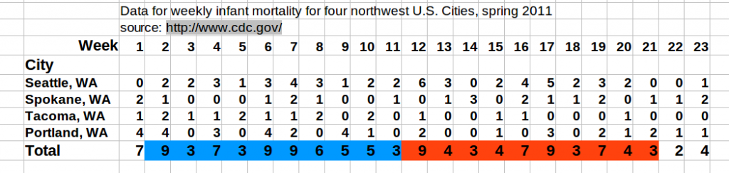
Imagine my surprise. I had been playing with the data a bit, and also checked what happens if you include Spokane and Tacoma (see the forum post for details). My conclusion was that Spokane and Tacoma did not matter, while Sprey’s re-analysis shows a 42% increase! I must have done some error, or? There were several steps when I copied the information into a spreadsheet, quite tedious to get it into the format that I wanted, so there were many possibilities for mistakes. So I made a few random double checks and could not find any error, but it would be very time consuming to go through the data for every week again. I also checked the published erratas on the CDC pages in order to see if I had missed some vital correction. But then I found a quicker way on the CDC web pages, it turns out that one also can download the data for individual cities or regions directly for the entire year (here). So I extracted the data for the four cities from this link, in this way I would do an independent check of my earlier results. Anyone can check it themselves on the link above. Here is my table:
The table includes weeks 1-23 for 2011. If I understand what Cockburn writes correctly, Sprey have used weeks 2-11 for the time period before Fukushima (compared with the four weeks used by Sherman and Mangano) and weeks 12-21 for the time period after Fukushima (i.e. the same as Sherman and Mangano). So, with the use of a very complicated mathematical operation, called addition, I get 59 for the period before Fukushima, and 53 for the period after. This is identical with my earlier count. As a final check I asked another member of NPYP to make an independent extraction of the data from the CDC data base and then perform the mathematical operation mentioned above. Once again identical results. Sprey got 55 and 78, close enough on the first one, but the second…
Unless I am missing something vital, the numbers in the table above speak for themselves; There is no dramatic increase for these four cities, so something must have gone seriously wrong in Sprey’s re-analysis. Actually there are more strange things, Cockburn writes that for the 8 cities the new analysis gave “an increase of infant deaths of only 2.4 per cent” after Fukushima, while my analysis gave a 14% decrease (it is not statistically significant, but if I was pro-nuclear in the same way that Sherman and Mangano are anti-nuclear, I would of course argue for that Fukushima has caused a reduction in the infant deaths in northwestern U.S., and that I had the numbers to show it). Could it be the addition part that failed, or does wishful thinking of the style “there must be an increase in infant mortality somewhere due to Fukushima” play a part? Whatever the cause, Cockburn is explaining the significance of some details in the data from Sprey:
Looking a little more closely at the time trend of the infant deaths after Fukushima, Sprey found that the most dramatic increases in deaths were in the two weeks right after the March 11 disaster. Those two weeks saw a near tripling of weekly deaths, followed by a period of somewhat elevated weekly deaths lasting for about five weeks – roughly 25 per over the pre-March 11 rate, then settling down close to the average pre-Fukushima death rate for the last three weeks of the ten week period post-disaster. These results are necessarily approximate because the weekly sample of deaths is too small for precise statistical conclusions.
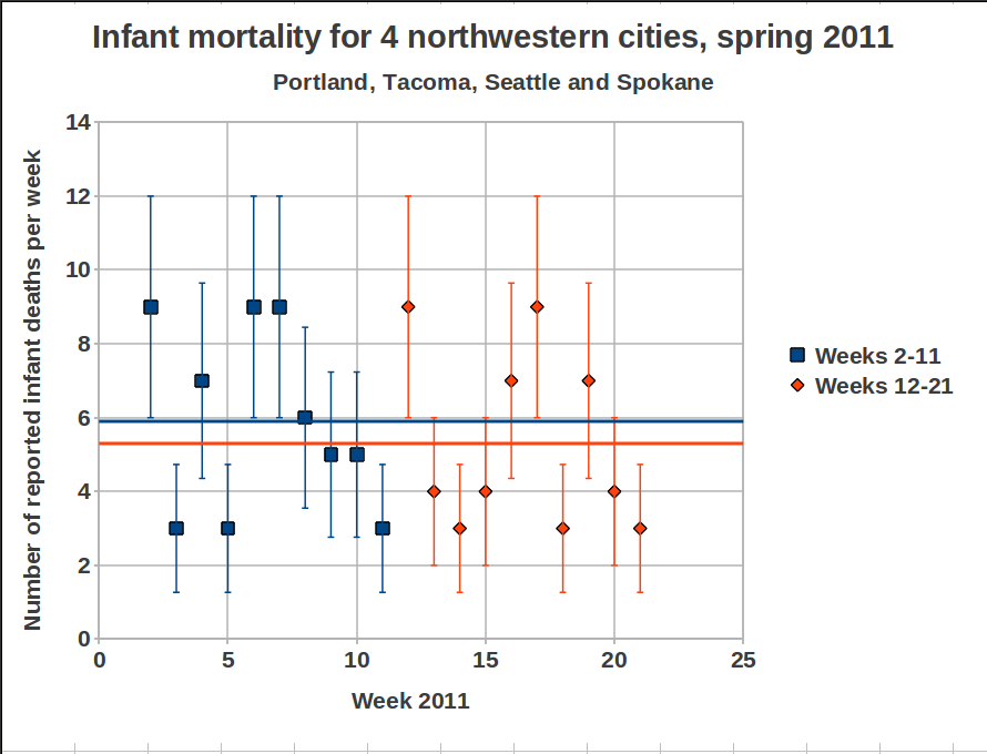
This part if of course nonsense when we look at the numbers. Let’s plot it as well:
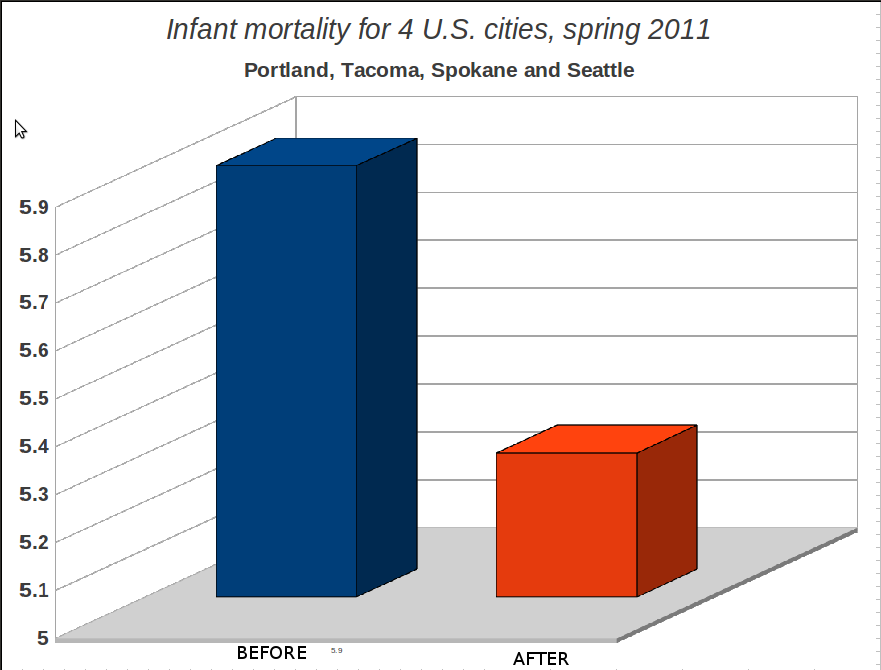
Well, as Cockburn says, there is a “dramatic” increase immediately after Fukushima, by a factor of 3. Now that we have the numbers ourselves we can conclude that a factor of 3 means a jump from 3 on week 11 to 9 on week 12. We have a similar increase in numbers between weeks 5 and 6, but Cockburn does not indicate that as being dramatic, in fact he does not mention it at all. To his defense, the numbers he is looking at are not the same as mine, but where do they come from? Whatever the cause of the error, the dramatic 42% increase now looks more like a…decrease, the mean values are shown as horizontal lines (blue before Fukushima, orange after) in the plot above. Let’s plot the data again to make sure, we can do it in the same way as Mangano does, to make it clear for everyone:
This is, of course, a very dishonest way of plotting things if you want to show the whole picture, but if Joseph Mangano can do it, they why shouldn’t we? The main point is anyhow clear, there is no increase in infant mortality in the United States of America due to Fukushima. Got it? And if there is, we will no find out through sloppy analysis by charlatans like Sherman and Mangano. And, as it seems, not through the statistics consultants that muck-raking journal CounterPunch is using. It will take careful analysis by serious researchers to find out if there is any real effect. If they would bother to start looking. But Mangano said in the Fox News interview
:
this is a red flag to raise for more studies to be done
Actually, he is right. It is a red flag to raise for careful scrutiny of all the earlier work by Sherman, Mangano, and their alarmistic friends. Some of their earlier studies have become “common knowledge” in anti-nuclear groups. Last year we had a member of the green party in Sweden standing in the parliament during a debate about nuclear power, where he referred to studies of increased childhood leukemia, authored by Sherman and Mangano, and of course the Chernobyl book edited by Sherman. Maybe we all can move on with life and more pressing issues now, ok? Those who want to hang on to all bad things with Fukushima still have plenty of material to work on. But stick to the facts, please. Ok? Two questions remain:
Why is Alexander Cockburn’s editorial so forgiving towards Sherman and Mangano? If I had been the editor of a journal, I would be furious if it turns out that some authors make fools of themselves, and of me as an editor, by cheating with data, and I would make sure that they were never to publish anything more in my journal. Ever. Especially when it comes to such an important issue that worries millions of people, not the least parents of small children. But Cockburn is so happy to have, through Sprey’s re-analysis, found that there was indeed an increase, so Sherman and Mangano was right even if they cheated, no shadow should fall upon them. After all, CounterPunch is a muck-raking newsletter with a radical attitude, so there must be some muck to find, and indeed they found it. But when it now turns out that not even this was right, what will he write in the next editorial? “We follow proudly in the sensationalist footsteps of William Randolph Hearst!” or what? We have already established that Janette Sherman and Joseph Mangano should be very ashamed of themselves. If I was Alexander Cockburn I would at least be quite embarrassed.
What went wrong in Sprey’s re-analysis?
An email has been sent to Alexander Cockburn, requesting that they do a muck-raking investigation of the skills of their statistical consultant. Furthermore, CounterPunch now has a great opportunity to recover their lost credibility; How about a couple of articles with in depth investigations of the earlier works of Janette Sherman and Joseph Mangano? This could be the starting point in a long series of muck-raking articles where all the controversial statements from the anti-nuclear icons are carefully scrutinized, could it be that there are more “common truths” out there that are based on the same weak evidence (i.e. none) as in the present case? Alexander Cockburn, are you up to the task?
Mattias Lantz – member of the independent network Nuclear Power Yes Please
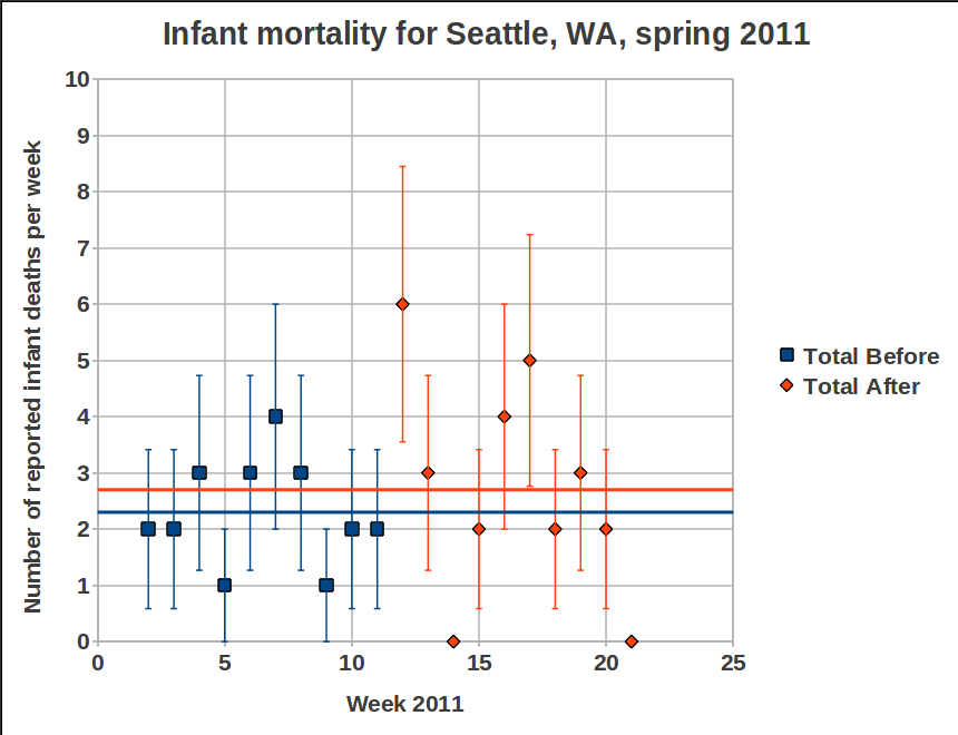
P.S. What about Seattle? Some observant persons may have noticed from the table above that Seattle does have an increase in infant mortality by a factor 3 between week 11 (2 deaths) and week 12 (6 cases). At least Seattle has an effect due to Fukushima, pretty please? Well, I’ll give you the plot for Seattle:
Infant mortality for Seattle, spring 2011, for stubborn people who wants to find increased infant mortality after Fukushima
6 cases the week that the radioactivity reached Seattle, compared to 2 the week before, that must be significant! If you still insist on this kind of reasoning, it means that you somehow have ignored the plots I show here and here. Still not convinced? Then go to the CDC data base and pick out the numbers for yourself, and please do not forget to check the pattern for Seattle week by week for earlier years. Here are the links to the CDC data base, instructions for some of them are found if you place the pointer over the link. I recommend to start with the last one, it is the easiest to handle:
The previous post was written in a rush, and somewhat in anger. Here is an attempt to explain better.
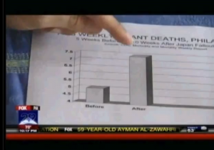
Joe Mangano shows his statistics to a reporter for Fox News
It seems as if it wasn’t enough for Joe Mangano to spread fear in the northwestern part of the U.S., so he decided to play the same game for Philadelphia, PA. One reason may be that relatively high levels of Iodine-131 in water have been recorded there recently. These are of course reasons for concern, and several reasons have been suggested (see for instance here(1), here(2) and here(3))
We leave that discussion aside and focus on Mangano’s new claims. For Philadelphia he suggests that a 48% increase of infant mortality is due to Fukushima. Below is the very detailed graphics (n.b.: irony) of the weekly rate of infant mortality before and after the radiation from Fukushima reached Philadelphia. The picture is a screen dump from the Fox News interview.
Joe Mangano's sophisticated statistics
Please note that is not enough for Mangano to cherry-pick the data, he is also keen on making the increase look very high by cutting the scale at 4, thus the “After”-pillar looks three times larger than the “Before”-pillar. Oh well, let’s not stay sore over that, we go back to his claims.
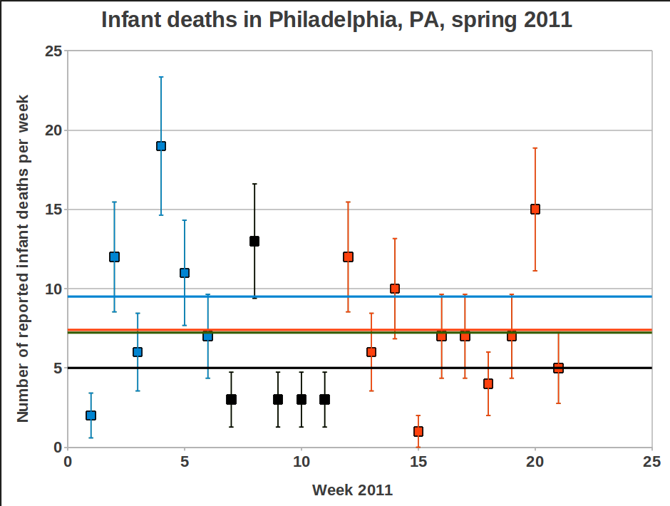
Number of infant deaths per week, spring 2011
Mangano’s “Before”-pillar corresponds to weeks 7 to 11 (black boxes). For the northwest Sherman and Mangano used weeks 8-11, now it seemed important to bring down the average value by adding week 7 in order to reduce the effect of the high value for week 8. The average becomes 5.0, to be compared with the ten following weeks (week 12-21) which have an average of 7.4. This is 48% higher value, just as Mangano says.
But once again, if we look at the first 6 weeks of the year, we find that the average for that period is 9.5! And the average value for the first 21 weeks of 2011 is 7.42, i.e. slightly higher than the alarming 48% increase level that gave Mangano a few minutes on fame on TV. In other words, Joe is trying to take us for a ride again. shame on him.
During the interview with Fox News he says, among other things:
The real benefit is that this is a red flag to raise for more studies to be done.
and
Is this a fluke or is there some other reason?We’ll see, but we can’t rule out Japan. Its too…too distinct.
The talk about a red flag could be a valid argument if data were more convincning. But the data only becomes “…too distinct” if we allow Mangano to play his tricks with them, i.e. by not showing a longer time trend before Fukushima. But there is a red flag to raise, a warning flag that Joseph Mangano is not a man to trust in these matters. And if he has done this, what says that any of his earlier studies have been performed in a more honest way.
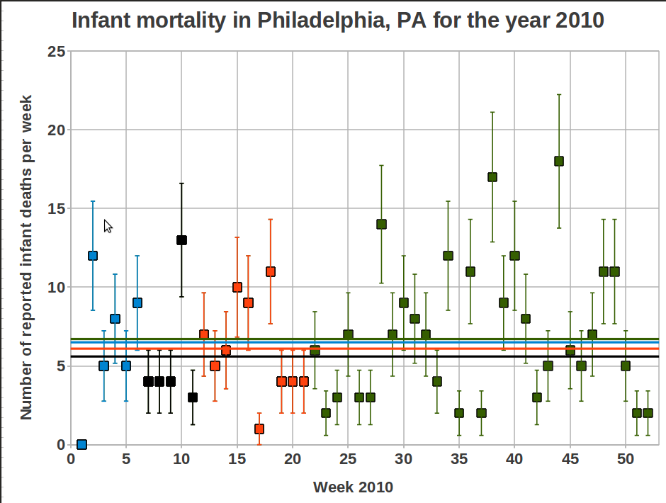
During the Fox News interview Mangano also claims that the data from CDC shows a decreasing trend for the corresponding weeks during the previous six years, and now after Fukushima we have a peak instead. Based on what we have seen above, this is a meaningless statement. My intention was to double check all the data for the last six years, but it takes some time to extract the data from the CDC data base and I have better things to do. Therefore I only show the data for 2010, with the same weeks marked for comparison.
Pleying the same game with data for 2010
The mean values for the different time periods are:
Weeks 1-6: 6.5 (9.5 for 2011)
Weeks 7-11: 5.6 (5.0 for 2011)
Weeks 12-21: 6.1 (7.4 for 2011)
Weeks 1-21: 6.1 (7.43 for 2011)
Weeks 1-52: 6.7 (answer for 2011 will come in January 2012)
So, just by comparing weeks 12-21 between 2010 and 2011 we see that yes, there is an increase for 2011, and Mangano may be correct about a decreasing trend for the years 2005-2010. But considering the great variation in data over the last year this does not indicate anything. There are many other things that Mangano would have to explain then as well, for instance why 7.4 infant deaths are of concern while 9.5 is not. Ah, silly me, a relatively high value is only important if there has been a nuclear accident during that time. Who am I to question that? 😉
Mattias Lantz – member on the independent network Nuclear Power Yes Please
Update 25 June 2011
Several persons have asked about how to get access to the raw data. I put a summary of the links I have used on the follow-up post regarding the strange results from the CounterPunch re-analysis of the data (here), but I will now put them here as well. The last link on the list is the one that is the easiest one to use. Some information will appear if you hold the pointer over each link:
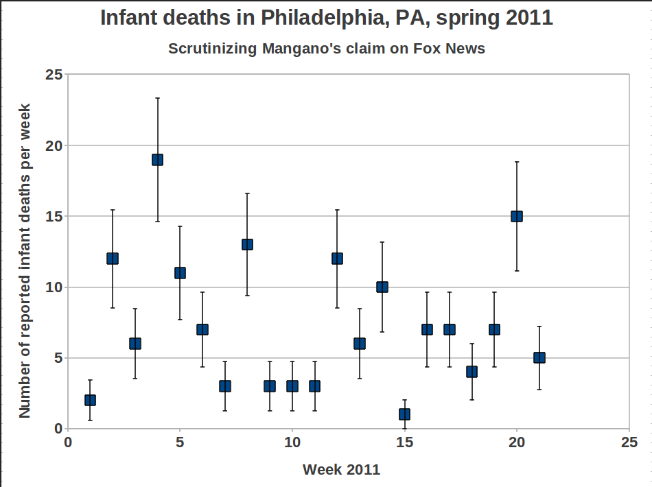
And here is a quick plotting of the data, I leave it to the readers to figure out the consequences of only using weeks 7 to 11 for comparison with the ten weeks after that.